SDK Setup Guide
Install the SDK
- Android
- iOS
- Flutter
- React Native
- Unity
Octopus is available on Maven Central.
Add the dependencies to your build.gradle file:
dependencies {
    // Core SDK functionalities
    implementation("com.octopuscommunity:octopus-sdk:x.x.x")
    // SDK UI Components (optional)
    implementation("com.octopuscommunity:octopus-sdk-ui:x.x.x")
}
See the Octopus SDK GitHub Release section to get the latest published version.
Octopus can be installed:
In an Xcode project
Open your workspace (.xcworkspace) or your project (.xcodeproj), open the File menu and open Add Package Dependencies. Then, paste the url of the Octopus Community SDK:
https://github.com/Octopus-Community/octopus-sdk-swift.git
On the next window, add both Octopus and OctopusUI to your target.
OR
In a Swift Package
Add the dependency to your package:
dependencies: [
    .package(url: "https://github.com/Octopus-Community/octopus-sdk-swift.git", from: "1.0.0"),
],
Add the SDK as a dependency to your target:
.target(
    name: "YourTarget",
    dependencies: [
        .product(name: "Octopus", package: "octopus-sdk-swift"),
        .product(name: "OctopusUI", package: "octopus-sdk-swift"),
    ]
),
Not recommended: Cocoapods
As CocoaPods is starting to be less and less used, some libraries are not available anymore. This is the case of SwiftGrpc, which the Octopus SDK's backend relies on. Hence, if you use the SDK using Cocoapods, you will be using an old version of SwiftGrpc.
If you really have to use the SDK with Cocoapods, here is how to do it:
- Copy the content of our podfile example in your podfile. Pay attention to the fact that the post_install script is setting iOS 14 as minimum requirement and setting
ENABLE_USER_SCRIPT_SANDBOXINGtoNO. - Then you can run
pod install
See the Octopus SDK GitHub Release section to get the latest published version.
The Octopus Flutter SDK is available on pub.dev.
Add the dependency to your pubspec.yaml:
dependencies:
  octopus_sdk_flutter: ^1.12.1
Then run:
flutter pub get
Android setup
In your android/app/build.gradle, make sure you have:
android {
    compileSdk 35
    defaultConfig {
        minSdk 24
    }
}
In your AndroidManifest.xml, add the INTERNET permission if not already present:
<uses-permission android:name="android.permission.INTERNET"/>
In your MainActivity.kt, make sure your activity extends FlutterFragmentActivity:
import io.flutter.embedding.android.FlutterFragmentActivity

class MainActivity : FlutterFragmentActivity()
iOS setup
In your ios/Podfile, set the minimum iOS version:
platform :ios, '16.0'
Then run:
cd ios && pod install
If you encounter a gRPC conflict, add the following to your Podfile:
pod 'gRPC-Swift', :modular_headers => true
See the Octopus Flutter SDK GitHub repository to get the latest published version.
Install the package using npm or yarn:
npm install @octopus-community/react-native
iOS setup
Add use_frameworks! :linkage => :static to your ios/Podfile, then run:
cd ios && pod install
Xcode 16+ is required.
Android setup
In your android/app/build.gradle, make sure you have:
android {
    compileSdk 35
    defaultConfig {
        minSdk 24
    }
}
Kotlin 2.x is required.
See the Octopus React Native SDK repository for the latest version and full setup instructions.
Octopus SDK for Unity is available via Unity Package Manager (UPM) or as a legacy .unitypackage file.
Unity Package Manager (recommended)
Add the Octopus SDK and the External Dependency Manager to your Packages/manifest.json:
{
  "dependencies": {
    "com.google.external-dependency-manager": "https://github.com/googlesamples/unity-jar-resolver.git?path=upm#v1.2.187",
    "com.octopuscommunity.octopus_sdk_for_unity": "https://github.com/Octopus-Community/octopus-sdk-unity.git?path=UnityPackage"
  }
}
Legacy .unitypackage
- Download the External Dependency Manager.
- Download OctopusCommunitySDK.unitypackage.
- Import both files into your Unity project.
Minimum Unity version: 2019.4. Build targets: Android, iOS.
See the Octopus SDK for Unity GitHub repository for the latest release.
Use the SDK
As early as possible in your code, you should initialize the OctopusSDK object.
This object is expecting two things:
- the Octopus Community API key
- the connection mode
You need to know the app managed fields (also called associated fields) that your community is configured for.
As a reminder, every associated profile field (nickname, picture and/or bio) of your users will be used in the Octopus Community profile of this user.
The user will only be able to change it in your profile edition interface and the data will be synced to its community profile.
On the opposite, every dissociated profile fields will only be used as prefilled values during Octopus profile creation.
After that, if a user changes its nickname in your app, it won't be reflected in Octopus Community, and the user will be able to change its community nickname in the community part.
- Android
- iOS
- Flutter
- React Native
- Unity
At least one app managed field
If your community has at least one associated field, you will have to create the SSO connection mode with the list of the associated fields.
Call the OctopusSDK initialization function in your Application's onCreate() block:
class YourApplication : Application() {

    override fun onCreate() {
        super.onCreate()

        OctopusSDK.initialize(
            context = this, // Application Context
            apiKey = "YOUR_API_KEY",
            connectionMode = ConnectionMode.SSO(
                // The list of associated fields
                appManagedFields = setOf(ProfileField.NICKNAME, ProfileField.PICTURE)
            )
        )
    }
}
OR
No app managed fields
When there is no app managed fields (i.e. all fields are dissociated), the API is simpler since you only have to configure it in SSO connection mode.
Call the OctopusSDK initialization function in your Application's onCreate() block:
class YourApplication : Application() {

    override fun onCreate() {
        super.onCreate()

        OctopusSDK.initialize(
            context = this, // Application Context
            apiKey = "YOUR_API_KEY",
            connectionMode = ConnectionMode.SSO()
        )
    }
}
The initialize function of OctopusSDK also accepts an optional configuration parameter:
-
apiServer: ApiServer?≥ 1.12.0: Custom server endpoint the SDK targets. Whennull(default), the SDK uses the Octopus default endpoint. Use this to route SDK traffic through a corporate WAF, a reverse-proxy, or an alternate environment.ApiServer(host, port)is throwing —hostis validated at construction time. Accepted host forms: DNS name ("api.example.com"), IPv4 literal ("192.0.2.10"), or IPv6 literal — bracketed ("[::1]") or unbracketed ("::1"). The host must not contain a scheme (https://), an embedded port (:443), a path, or whitespace. The defaultportis443. On validation failure, the constructor throwsApiServer.ValidationError(a sealedIllegalArgumentExceptionsubclass with casesEmptyHost,HostContainsScheme,HostContainsPortOrPath,HostContainsWhitespace,InvalidIPv6Bracketing— readmessageto diagnose).
Here is how to use it during SDK initialization:
import com.octopuscommunity.sdk.ApiServer
import com.octopuscommunity.sdk.OctopusSDK

OctopusSDK.initialize(
    context = this,
    apiKey = "YOUR_API_KEY",
    connectionMode = ConnectionMode.SSO(),
    // Optional — omit to use the Octopus default endpoint.
    apiServer = ApiServer(host = "api.example.com")
)
Pass apiServer only when you need to point the SDK at a non-default environment — otherwise leave the default.
At least one app managed field
If your community has at least one associated field, you will have to create the SSO connection mode with:
- the list of the associated fields
- the block that will be called when OctopusSDK needs a logged in user. When this block is called, you should start to display your login process.
- the block that will be called when the user tries to modify some fields related to its profile. When this block is called, you should open the profile edition. This block has a ProfileField optional parameter. It indicates the field that the user tapped to edit if there is one.
import Octopus

/* (...) */

let octopus = try OctopusSDK(
    apiKey: "YOUR_API_KEY",
    connectionMode: .sso(
      .init(
        appManagedFields: [.nickname, .picture], // the list of associated fields
        loginRequired: {
            // Put the code here to open your login flow
        },
        modifyUser: { fieldToEdit in
            // Put the code here to open your profile edition screen
            // `fieldToEdit` is the field that has been asked to be edited by the user. Nil if the user tapped on "Edit my profile".
        }
      )
    )
)
OR
No app managed fields
When there is no app managed fields (i.e. all fields are dissociated), the API is simpler since it only requires a callback to display the login flow. When this block is called, you should start to display your login process.
import Octopus

/* (...) */

let octopus = try OctopusSDK(
    apiKey: "YOUR_API_KEY",
    connectionMode: .sso(
      .init(
        loginRequired: {
            // Put the code here to open your login flow
        }
      )
    )
)
The init function of the OctopusSDK also lets you provide a custom configuration (default config is used if you don't pass it). Here is what you can configure:
-
appManagedAudioSession: Bool: If false, the SDK will set the AVAudioSession category to .playback or .ambient when a video is playing to ensure audio plays in silent mode. Default is false. You can set it to true if your app is already managing audio session, to avoid that Octopus changes your config. -
apiServer: OctopusSDK.Configuration.ApiServer?≥ 1.12.0: Custom server endpoint the SDK targets. Whennil(default), the SDK uses the Octopus default endpoint. Use this to route SDK traffic through a corporate WAF, a reverse-proxy, or an alternate environment.ApiServer(host:port:)is throwing —hostis validated at construction time. Accepted host forms: DNS name ("api.example.com"), IPv4 literal ("192.0.2.10"), or IPv6 literal — bracketed ("[::1]") or unbracketed ("::1"). The host must not contain a scheme (https://), an embedded port (:443), a path, or whitespace. The defaultportis443. On validation failure, the initializer throws anOctopusSDK.Configuration.ApiServer.ValidationErrorwhosedebugDescriptiondescribes the problem.
Here is how to use the config during SDK initialization:
import Octopus

let octopus = try OctopusSDK(
    apiKey: "YOUR_API_KEY",
    connectionMode: ..., // see above to chose the connection mode
    configuration: OctopusSDK.Configuration(
        // Optional — omit to use the Octopus default endpoint.
        apiServer: try .init(host: "api.example.com"),
        appManagedAudioSession: true
    )
)
Pass apiServer only when you need to point the SDK at a non-default environment — otherwise leave the default.
At least one app managed field
If your community has at least one associated field, you will have to create the SSO connection mode with the list of the associated fields.
Initialize the SDK as early as possible in your app:
import 'package:octopus_sdk_flutter/octopus_sdk_flutter.dart';

final octopus = OctopusSDK();

await octopus.initialize(
    apiKey: 'YOUR_API_KEY',
    appManagedFields: [ProfileField.nickname, ProfileField.picture],
);
OR
No app managed fields
When there is no app managed fields (i.e. all fields are dissociated), the API is simpler since you only have to configure it in SSO connection mode.
Initialize the SDK as early as possible in your app:
import 'package:octopus_sdk_flutter/octopus_sdk_flutter.dart';

final octopus = OctopusSDK();

await octopus.initialize(
    apiKey: 'YOUR_API_KEY',
);
The initialize function also accepts an optional configuration parameter:
-
apiServer: ApiServer?≥ 1.12.0: Custom server endpoint the SDK targets. Whennull(default), the SDK uses the Octopus default endpoint over TLS. Use this to route SDK traffic through a corporate WAF, a reverse-proxy, or an alternate environment.ApiServer(host:, port:)is throwing —hostis validated at construction time. Accepted host forms: DNS name ("api.example.com"), IPv4 literal ("192.0.2.10"), or IPv6 literal — bracketed ("[::1]") or unbracketed ("::1"). The host must not contain a scheme (https://), an embedded port (:443), a path, or whitespace. The defaultportis443. On validation failure, the constructor throws anApiServerValidationError(anArgumentErrorsubclass); inspect itskindto diagnose.
Here is how to use it during SDK initialization:
import 'package:octopus_sdk_flutter/octopus_sdk_flutter.dart';

final octopus = OctopusSDK();

await octopus.initialize(
    apiKey: 'YOUR_API_KEY',
    // Optional — omit to use the Octopus default endpoint.
    apiServer: ApiServer(host: 'api.example.com'),
);
Pass apiServer only when you need to point the SDK at a non-default environment — otherwise leave the default.
Upgrading from < 1.11.0 with ProfileField.picture: A bug in versions before 1.11.0 caused ProfileField.picture to be silently dropped when passed in appManagedFields, so users could still edit their profile picture inside the Octopus UI. This is fixed in 1.11.0 — the field is now correctly locked. If your app passes ProfileField.picture in appManagedFields, re-test your profile flows after upgrading: picture edits will now be blocked in the Octopus UI and routed through the onModifyUser callback instead.
At least one app managed field
If your community has at least one associated field, you will have to create the SSO connection mode with the list of the associated fields.
Initialize the SDK as early as possible in your app (e.g. in App.tsx before any navigation):
import { initialize } from '@octopus-community/react-native';

await initialize({
    apiKey: 'YOUR_API_KEY',
    connectionMode: {
        type: 'sso',
        appManagedFields: ['username', 'profilePicture'],
    },
});
OR
No app managed fields
When there is no app managed fields (i.e. all fields are dissociated), the API is simpler since you only have to configure it in SSO connection mode.
Initialize the SDK as early as possible in your app:
import { initialize } from '@octopus-community/react-native';

await initialize({
    apiKey: 'YOUR_API_KEY',
    connectionMode: {
        type: 'sso',
        appManagedFields: [],
    },
});
Call Initialize as early as possible — for example in a MonoBehaviour.Start():
// With app-managed profile fields
OctopusSDK.Initialize("YOUR_API_KEY",
    ConnectionMode.SSO(
        ProfileField.NICKNAME
        // ,ProfileField.BIO
        // ,ProfileField.PICTURE
    )
);

// Without app-managed profile fields
OctopusSDK.Initialize("YOUR_API_KEY", ConnectionMode.SSO());
In the Unity Editor, the SDK runs against a built-in mock backend ≥ 1.12.1 so you can integrate and write EditMode tests without building to a device. See Editor Mock Mode for Unity.
Link your user to the SDK
Your application is managing the connection status of the user and inform the Octopus SDK when the user is connected/disconnected
The connectUser API lets you pass the userId. This userId is the string that will identify your user for Octopus.
It needs to be unique and always refer to the same user.
You can also pass profile information (nickname, bio, picture). These fields will be used differently depending on whether the field is associated (i.e. in the app managed fields that you provided during SDK initialization) or not:
-
if the field is associated, each time the connectUser function will be called, Octopus will update the field in the user's community profile with the data you provided. Hence, the field in the community profile of the user will always be the same value as in its app profile
-
if the field is not associated, the data you provided will only be used to fill the community profile until the user edits its community profile. Once its done, their community profile remains separate from yours, meaning any updates made to your profile will not be reflected in theirs, and vice versa.
This is why you should call the connectUser function as soon as the user profile changes.
Client User Token
For security reasons, to ensure that the connected user is legitimate, the API informing the SDK of a user’s connection
includes a callback that provides a signed token for authentication. In other words, the SDK will request a token from
you when needed to authenticate the user.
Therefore, you must add a route like /generateOctopusSsoToken to your backend to generate this token.
Follow the Generate a signed JWT for SSO guide for more information
- Android
- iOS
- Flutter
- React Native
- Unity
Inform the SDK that your user is connected:
≥ 1.6.0OctopusSDK.connectUser(
user = ClientUser(
userId = yourUserId, // Unique identifier of your user
profile = ClientUser.Profile(
nickname = yourUserNickname, // nickname is String?
bio = yourUserBio, // bio is String?
picture = yourUserPicture // A Remote URL or a Local Uri
)
),
tokenProvider = {
// Fetch asynchronously this user token (suspended callback)
// by calling your /generateOctopusSsoToken route
}
)
Check the Community ViewModel Sample for a complete use case.
Deprecated < 1.6.0
OctopusSDK.connectUser(
    user = ClientUser(
        userId = yourUser.id,
        profile = ClientUser.Profile(
            nickname = yourUser.name,
            bio = yourUser.bio,
            picture = yourUser.picture,
            // Age Information:
            // - LegalAgeReached = Your user is more than 16 years old
            // - Underaged = Your user is less than 16 years old
            // - null = You don't know
            ageInformation = AgeInformation.LegalAgeReached
        )
    ),
    tokenProvider = {
        // Return asynchronously this user token (suspended callback)
        // by calling your /generateOctopusSsoToken route
    }
)
- Inform the SDK that your user is disconnected:
// suspend function — call from a coroutine
OctopusSDK.disconnectUser()
- Optional: Monitor whether the user is connected to the Octopus platform:
OctopusSDK.isUserConnected
Inform the SDK that your user is connected:
≥ 1.11.0do {
try await octopus.connectUser(
ClientUser(
userId: yourUser.id,
profile: ClientUser.Profile(
nickname: yourUser.name, // nickname is String?
bio: yourUser.bio, // bio is String?
picture: yourUser.picture // picture is Data?, this Data will be transformed into an UIImage using `UIImage(data:)` so it must be compatible.
)
),
tokenProvider: {
// Fetch asynchronously this user token
// by calling your /generateOctopusSsoToken route
}
)
} catch {
// handle the error
}
Deprecated < 1.11.0
octopus.connectUser(
    ClientUser(
        userId: yourUser.id,
        profile: ClientUser.Profile(
            nickname: yourUser.name,   // nickname is String?
            bio: yourUser.bio,         // bio is String?
            picture: yourUser.picture  // picture is Data?, this Data will be transformed into an UIImage using `UIImage(data:)` so it must be compatible.
        )
    ),
    tokenProvider: {
        // Fetch asynchronously this user token
        // by calling your /generateOctopusSsoToken route
    }
)
Deprecated < 1.6.0
octopus.connectUser(
    ClientUser(
        userId: yourUser.id,
        profile: ClientUser.Profile(
            nickname: yourUser.name,
            bio: yourUser.bio,
            picture: yourUser.picture,
            ageInformation: .legalAgeReached // if your user is more than 16 years old. Pass .underaged if they are less than 16. Pass nil if you don't know
        )
    ),
    tokenProvider: {
        // Fetch asynchronously this user token
        // by calling your /generateOctopusSsoToken route
    }
)
Inform the SDK that your user is disconnected:
≥ 1.11.0do {
try await octopus.disconnectUser()
} catch {
// Disconnection failed (typically a network or server issue).
// You can retry or ignore — the local session state is cleared regardless.
}
Deprecated < 1.11.0
octopus.disconnectUser()
Inform the SDK that your user is connected. Provide a tokenProvider
callback — the SDK calls it whenever it needs a signed token to
authenticate the user:
await octopus.connectUserWithTokenProvider(
    userId: yourUserId, // Unique identifier of your user
    nickname: yourUserNickname, // String? - optional
    bio: yourUserBio, // String? - optional
    picture: yourUserPicture, // String? - A Remote URL
    tokenProvider: () async {
        // Fetch asynchronously this user token
        // by calling your /generateOctopusSsoToken route
        return token;
    },
);
Always use a tokenProvider rather than a pre-minted static token. SSO JWTs
expire; the SDK re-invokes the provider when it needs to re-authenticate the
user (for example when refreshing entitlements), so it must be able to return
a freshly signed token each time it is called.
Inform the SDK that your user is disconnected:
await octopus.disconnectUser();
First, set up a token provider. In React components, use the useUserTokenProvider hook:
import { useUserTokenProvider, connectUser, disconnectUser } from '@octopus-community/react-native';

function App() {
    useUserTokenProvider(async () => {
        // Fetch the user token from your backend
        // by calling your /generateOctopusSsoToken route
        const response = await fetch('https://your-backend.com/generateOctopusSsoToken');
        const { token } = await response.json();
        return token;
    });

    // ...
}
Outside of React components, use addUserTokenRequestListener instead:
import { addUserTokenRequestListener } from '@octopus-community/react-native';

const subscription = addUserTokenRequestListener(async () => {
    const response = await fetch('https://your-backend.com/generateOctopusSsoToken');
    const { token } = await response.json();
    return token;
});

// Later, to unsubscribe:
subscription.remove();
Inform the SDK that your user is connected:
await connectUser({
    userId: yourUserId, // Required — unique identifier of your user
    profile: {
        username: yourUserNickname, // string | undefined
        biography: yourUserBio, // string | undefined
        profilePicture: yourUserPicture, // string | undefined — a remote URL or local file path
    },
});
Breaking change in v1.9: The legalAgeReached field has been removed from the profile object. If your code was passing legalAgeReached, remove it when upgrading to v1.9.
Inform the SDK that your user is disconnected:
await disconnectUser();
Inform the SDK when your user signs in:
await OctopusSDK.ConnectUser(userId, nickname, bio, picture, GetToken);

async Task<string> GetToken()
{
    // Contact your backend to obtain a signed JWT
    return "signed_jwt_from_your_backend";
}
Inform the SDK when your user signs out:
await OctopusSDK.DisconnectUser();
When using app-managed profile fields, handle edit requests from the community UI:
OctopusSDK.OnModifyUser += (ProfileField? field) =>
{
    // Open your own profile editor
};
If your SSO setup uses forced login (contact us for this setting), handle the login-required event:
OctopusSDK.OnLoginRequired += () =>
{
    // Trigger your app's sign-in flow, then call ConnectUser
};
Read connected-user entitlements ≥ 1.12.0
The SDK exposes the entitlements held by the connected user as an observable. Entitlement identifiers are opaque tokens defined by your backend and injected via the SSO JWT — the SDK does not intersect them against per-group requirements client-side. Group access decisions are pre-resolved server-side and surfaced via OctopusGroup.canAccess (see Gate access to locked groups). Use the entitlement set only for your own host-side UI (badges, feature gating, etc.).
The profile is null until a user is connected.
- Android
- iOS
- Flutter
- React Native
- Unity
OctopusSDK.profile.collect { profile ->
    val entitlements: Set<String> = profile?.entitlements ?: emptySet()
    // Update your host-side UI based on the held entitlements
}
octopus.$profile
    .sink { profile in
        let entitlements: Set<String> = profile?.entitlements ?? []
        // Update your host-side UI based on the held entitlements
    }
OctopusSDK.profile.listen((profile) {
    final Set<String> entitlements = profile?.entitlements ?? <String>{};
    // Update your host-side UI based on the held entitlements
});
Entitlements are not yet available on React Native.
Entitlements are not yet available on Unity.
Refresh entitlements ≥ 1.12.0
When your user's entitlements change in your backend (for example, after a premium purchase), call refreshEntitlements() to fetch the fresh set. The SDK re-invokes the token provider registered at connectUser time to obtain a fresh signed JWT, exchanges it for a new Octopus JWT carrying the updated entitlements, updates the cached profile, and refetches the groups so observing screens recompose with the new access decisions.
Only supported in SSO connection mode with a connected (non-guest) user that was connected with a token provider. Magic-link / guest sessions, or a user connected with a static pre-minted token, cannot refresh entitlements — there is no client-signed JWT to re-mint.
- Android
- iOS
- Flutter
- React Native
- Unity
when (val result = OctopusSDK.refreshEntitlements()) {
    is OctopusResult.Success -> {
        // Entitlements refreshed. OctopusSDK.profile and OctopusSDK.groups re-emit.
    }
    is OctopusResult.Failure.InvalidArguments -> {
        when (val error = result.error) {
            is RefreshEntitlementsError.NoClientTokenProvider -> {} // not in SSO / no token provider
            is RefreshEntitlementsError.UserNotConnected      -> {} // no connected user
            is RefreshEntitlementsError.NoNetwork             -> {} // device offline
            is RefreshEntitlementsError.UserBanned            -> {
                // error.errorMessage is BE-provided and suitable for direct display
            }
            is RefreshEntitlementsError.ServerError           -> {} // backend error
        }
    }
    else -> {
        // Other transport-level failures (e.g. unauthenticated)
    }
}
do {
    try await octopus.refreshEntitlements()
    // Entitlements refreshed. octopus.$profile and octopus.$groups re-emit.
} catch let error as OctopusRefreshEntitlementsError {
    switch error {
    case .noClientTokenProvider: break // not in SSO / no token provider
    case .userNotConnected:      break // no connected user
    case .noNetwork:             break // device offline
    case .userBanned(let message):
        break // `message` is BE-provided and suitable for direct display
    case .serverError(let underlying):
        break // backend error
    }
}
Requires a user connected with connectUserWithTokenProvider — a static pre-minted token cannot be re-minted.
final result = await OctopusSDK().refreshEntitlements();
switch (result) {
    case OctopusSuccess():
        // Entitlements refreshed. OctopusSDK.profile and OctopusSDK.groups re-emit.
    case OctopusInvalidArguments<RefreshEntitlementsError>(:final errors):
        // Handled SDK failures, typed in `errors`:
        // RefreshEntitlementsNoClientTokenProviderError, RefreshEntitlementsUserNotConnectedError,
        // RefreshEntitlementsNoNetworkError, RefreshEntitlementsUserBannedError (errorMessage displayable),
        // RefreshEntitlementsServerError
    case OctopusConnectionFailure():
        // Transport/auth failure
}
Refreshing entitlements is not yet available on React Native.
Refreshing entitlements is not yet available on Unity.
Display the Octopus Community UI
Now that you have the SDK properly configured, you can add a button in your app that opens the Octopus Community UI.
- Android
- iOS
- Flutter
- React Native
- Unity
- Add the
OctopusHomeContentcomposable to your community screen.
OctopusTheme(...) { // Customize the Octopus Theme here
    OctopusHomeContent(
        modifier = Modifier.fillMaxSize(),
        navController = navController, // Your main NavHostController
        onNavigateToLogin = {
            // This block will be called when OctopusSDK needs a logged-in user.
            // You should launch your login process here.
            // Example: navController.navigate(LoginRoute)
            // Once the user is logged in, you need to call OctopusSDK.connectUser(...) to link
            // them with Octopus
        },
        // Optional: If your community has at least one associated field:
        onNavigateToProfileEdit = { profileField ->
            // This block will be called when the user tries to modify some fields related
            // to their profile.
            // When this block is called, you should open your profile edition screen.
            // Example: navController.navigate(ProfileScreen(focusNickname = fieldToEdit == ProfileField.NICKNAME))
            // Once the user has edited their profile, you should call OctopusSDK.connectUser(...) to update the Octopus profile.
        }
    )
}
Check the Community Screen Sample for basic usage.
- Declare other Octopus sub-screens in your main
NavHost:
NavHost(...) { // Your main NavHost
    octopusComposables(
        navController = navController, // Your main NavHostController
        onNavigateToLogin = { ... },
        onNavigateToProfileEdit = { ... }
    ) { backStackEntry, content ->
        // Customize the Octopus Theme possibly based on a specific Octopus Screen here
        OctopusTheme(...) {
            content()
        }
    }
}
This function registers multiple composable() destinations in your NavGraphBuilder for adding the Octopus SDK navigation flow to your app.
Depending on your use case integration mode check the various samples:
First, import Octopus UI:
import OctopusUI
Octopus handles its own navigation, so you must not embed it in a navigation stack.
@State private var openOctopus = false

var body: some View {
    Button("Open Octopus Community") {
        openOctopus = true
    }.fullScreenCover(isPresented: $openOctopus) {
        OctopusHomeScreen(octopus: octopus, navigationMode: .navigationStack)
    }
}
When OctopusHomeScreen is presented inside a modal (.sheet, .fullScreenCover, or a Flutter / React Native modal route), pass navigationMode: .navigationStack so that in-app navigation (e.g. tapping a post to open its detail) works correctly. Without it, the default internal navigation container can silently drop pushes in modal contexts.
When displaying OctopusHomeScreen in a non-modal context (e.g. as a tab or pushed onto an existing stack), the default .automatic mode is correct — you can omit the parameter entirely:
OctopusHomeScreen(octopus: octopus)
If you're using a UITabBarController to display the Octopus UI inside a UIHostingController, you might encounter a safe area bug. This is a known bug not related to the Octopus SDK UI. To fix it, you might want to add the UITabBarController children in the code instead of in the Storyboard. Otherwise, you can add a negative padding equal to tabBarController.tabBar.frame.size.height to the OctopusUI.
You can display the Octopus Community UI as an embedded widget.
Embedded widget:
OctopusHomeScreen(
    onNavigateToLogin: () {
        // This callback will be called when OctopusSDK needs a logged-in user.
        // You should launch your login process here.
    },
    onModifyUser: (String? field) {
        // This callback will be called when the user tries to modify some fields
        // related to their profile.
        // `field` indicates the field that the user tapped to edit, if any.
    },
)
Fullscreen mode:
Call openUI() to display the Octopus Community in fullscreen. Use closeUI() to dismiss it programmatically:
import { openUI, closeUI } from '@octopus-community/react-native';

// Open the community UI
await openUI();

// Optionally, close it programmatically
await closeUI();
Embedded mode:
Use the OctopusUIView component to embed the community UI inline within a screen:
import { OctopusUIView } from '@octopus-community/react-native';
import { View, StyleSheet } from 'react-native';

function CommunityScreen() {
    return (
        <View style={{ flex: 1 }}>
            <OctopusUIView style={StyleSheet.absoluteFill} />
        </View>
    );
}
Both modes require initialize() to be called first.
Open the Octopus Community UI from any button or event:
OctopusSDK.Open();
Open a specific screen ≥ 1.11.0
By default, the Octopus UI opens on the main feed. You can also open it directly on a specific screen, such as a post or a group.
- Android
- iOS
- Flutter
- React Native
- Unity
Android does not use a single initialScreen parameter — navigation is driven by the standard NavHostController. Two patterns are available depending on the integration mode:
Open in the community context (with back navigation to the main feed)
If your app integrates the Octopus navigation graph via octopusComposables(navController), use the dedicated navigateToOctopusPost / navigateToOctopusGroup / navigateToOctopusCreatePost helpers. The user can then navigate back to the main feed naturally.
Open a post:
navController.navigateToOctopusPost(postId = "your-post-id")
Open a group: ≥ 1.11.0
navController.navigateToOctopusGroup(groupId = "your-group-id")
See the List available groups section to retrieve the list of available group ids.
A navigateToOctopusHome() helper is also available to return to the main feed from anywhere.
Open the post creation (Bridge Share): ≥ 1.12.0
Opens the post editor for a Bridge Share — optionally prefilled with content supplied by your app (text, image, group, optional CTA). The user can freely edit text, image, and group in the editor; the CTA travels invisibly through and is attached to the published post.
Parameters of OctopusPrefilledPost:
text: String?— Optional initial text shown in the editor.image: Uri?— Optional local content URI of an initial image. The SDK does not fetch remote URLs — the host materializes the image first. If the URI is granted viaActivityResultContracts.PickVisualMedia(or a similar contract), callcontentResolver.takePersistableUriPermission(...)before navigating so the URI survives configuration changes and process death.topicId: String?— Optional id of the group the post should land in. Ifnullor inaccessible, the editor forces the user to pick a group before publishing.cta: OctopusPostCTA?— Optional call-to-action attached to the published post. Not displayed in the editor.
At least one of text / image must be non-null. Empty strings for text and blank values for image / topicId are normalised to null before validation. The constructor throws OctopusPrefilledPost.ValidationError (a sealed IllegalArgumentException subclass) on invalid input. OctopusPostCTA(url, label) is a plain data class — its fields are validated inside OctopusPrefilledPost when a CTA is attached.
import androidx.core.net.toUri
import com.octopuscommunity.sdk.domain.model.CreatePostScreenInfo
import com.octopuscommunity.sdk.domain.model.OctopusPostCTA
import com.octopuscommunity.sdk.domain.model.OctopusPrefilledPost
import com.octopuscommunity.sdk.ui.navigateToOctopusCreatePost

try {
    val prefill = OctopusPrefilledPost(
        text = "The perfect Canelés",
        image = canelesImageUri,        // android.net.Uri or null
        topicId = foodRecipeGroupId,    // null = let the user pick a group
        cta = OctopusPostCTA(
            url = "https://example.com/recipes/caneles".toUri(),
            label = "Read the recipe",
        ),
    )
    navController.navigateToOctopusCreatePost(
        info = CreatePostScreenInfo(prefilledPost = prefill),
    )
} catch (e: OctopusPrefilledPost.ValidationError) {
    // Display the host-side error UX; no community navigation happened.
}
Passing CreatePostScreenInfo() (or omitting info) opens the editor empty — equivalent to today's in-SDK new-post flow.
Image-dimension validation (decode, ratio, min side) runs inside the editor pipeline when the screen opens — same shape as a user-picked image. The CTA is invisible in the editor — the user can edit text / image / group, but cannot view, edit, or remove the CTA before publishing.
Open a single post or group in isolation (bridge mode)
When you do not want to integrate the full Octopus navigation graph, use the dedicated public composables in standalone mode. The screen displays a back arrow in the top app bar; tapping it (or using the system back gesture) returns to your app.
Open a post:
OctopusPostDetailsScreen(
    navController = navController,
    postId = "your-post-id"
)
Open a group: ≥ 1.11.0
OctopusGroupDetailsScreen(
    navController = navController,
    groupId = "your-group-id"
)
Open the post creation (Bridge Share): ≥ 1.12.0
OctopusCreatePostScreen(
    navController = navController,
    info = CreatePostScreenInfo(prefilledPost = prefill),
)
Both OctopusPostDetailsScreen and OctopusGroupDetailsScreen also have a Content variant (OctopusPostDetailsContent, OctopusGroupDetailsContent) that exposes navigation callbacks for SSO integration (login, profile edit, URL handling).
The initialScreen parameter accepts the following values:
.mainFeed(default) — Opens the main feed with the feed selector..post(.init(postId: "your-post-id"))— Opens a specific post in bridge mode: a focused single-post screen, separate from the main-feed navigation..group(.init(groupId: "your-group-id"))— Opens a specific group's feed in bridge mode (same as.post). See the List available groups section to retrieve the list of available group ids..createPost(.init(prefilledPost: ...))≥ 1.12.0 — Opens the post editor, optionally prefilled with content supplied by your app (text, image, group, optional CTA). The user can freely edit text, image, and group in the editor; the CTA travels invisibly through and is attached to the published post.
Open a post:
OctopusHomeScreen(
    octopus: octopus,
    initialScreen: .post(.init(postId: postId))
)
Open a group:
OctopusHomeScreen(
    octopus: octopus,
    initialScreen: .group(.init(groupId: groupId))
)
Open the post creation (Bridge Share): ≥ 1.12.0
Parameters of OctopusPrefilledPost:
text: String?— Optional initial text shown in the editor.image: Data?— Optional local image bytes (e.g.UIImage(...).jpegData(...)). The SDK does not fetch remote URLs — the host materializes the image first.topicId: String?— Optional id of the group the post should land in. Ifnilor inaccessible, the editor forces the user to pick a group before publishing.cta: OctopusPrefilledPost.CTA?— Optional call-to-action attached to the published post. Not displayed in the editor.
At least one of text / image must be non-nil. The initializer is throwing — it reuses the same validation rules the editor enforces at publish time (text length, image decode / size / ratio), so integration bugs surface during client-app QA instead of after the editor opens. Failures throw OctopusPrefilledPost.ValidationError; read debugDescription to diagnose.
import Octopus
import OctopusUI

// Build the payload — handle validation errors before any navigation:
let prefill: OctopusPrefilledPost
do {
    prefill = try OctopusPrefilledPost(
        text: "The perfect Canelés",
        image: image.jpegData(compressionQuality: 1),
        topicId: foodRecipeGroupId,   // nil = let the user pick a group
        cta: try .init(
            url: URL(string: "https://example.com/recipes/caneles")!,
            label: "Read the recipe"
        )
    )
} catch let error as OctopusPrefilledPost.ValidationError {
    // Display the host-side error UX; the editor was never opened.
    return
}

// Then display OctopusHomeScreen as usual (e.g. inside a .fullScreenCover):
OctopusHomeScreen(
    octopus: octopus,
    initialScreen: .createPost(.init(prefilledPost: prefill))
)
Passing .createPost(.init()) (with prefilledPost: nil) opens the editor empty — equivalent to a regular in-SDK new-post flow.
On publish or cancel, the SDK auto-dismisses OctopusHomeScreen back to your host. The CTA is invisible in the editor — the user can edit text / image / group, but cannot view, edit, or remove the CTA before publishing.
Pass an OctopusInitialScreen to the initialScreen parameter of the OctopusHomeScreen widget. It accepts the following values:
OctopusInitialScreen.mainFeed()(default) — Opens the main feed with the feed selector.OctopusInitialScreen.post(PostScreenInfo(postId: "your-post-id"))— Opens a specific post in bridge mode (the user cannot navigate back to the main feed; they dismiss the screen to return to your app).OctopusInitialScreen.group(GroupScreenInfo(groupId: "your-group-id"))— Opens a specific group's feed in bridge mode. See the List available groups section to retrieve the list of available group ids.OctopusInitialScreen.createPost(CreatePostScreenInfo(...))— Opens the post editor, optionally prefilled with content supplied by your app.
When omitted (null), the view opens on the main feed. If a notification carrying a non-empty deep link is also supplied at the same mount, the deep link wins and initialScreen is ignored.
Open a post:
OctopusHomeScreen(
    initialScreen: OctopusInitialScreen.post(
        PostScreenInfo(postId: "your-post-id"),
    ),
)
Open a group:
OctopusHomeScreen(
    initialScreen: OctopusInitialScreen.group(
        GroupScreenInfo(groupId: "your-group-id"),
    ),
)
As a convenience, the dedicated OctopusPostDetailsScreen / OctopusGroupDetailsScreen widgets open a single post or group in bridge mode without building an OctopusInitialScreen yourself. They expose the same callbacks as OctopusHomeScreen (onNavigateToLogin, onModifyUser, onNavigateToUrl):
OctopusPostDetailsScreen(postId: "your-post-id")

OctopusGroupDetailsScreen(groupId: "your-group-id")
Open the post creation (Bridge Share):
Prefill the editor with an OctopusPrefilledPost (text, target group, optional invisible CTA). The user can freely edit the text and group; the CTA travels invisibly through and is attached to the published post.
Parameters of OctopusPrefilledPost:
text: String?— Optional initial text. When present, its length must be between 10 and 5000 characters.image: Uint8List?— Optional local image bytes. Dropped when opened throughOctopusHomeScreen(the embedded route) — useOctopusSDK().showOctopusCreatePostScreen(...)for the image-share flow. The SDK never fetches remote URLs — materialize the bytes first.topicId: String?— Optional id of the group the post should land in. Ifnullor inaccessible, the editor forces the user to pick a group before publishing.cta: OctopusPostCTA?— Optional call-to-action (OctopusPostCTA(url:, label:)) attached to the published post. Not displayed in the editor.
At least one of text / image must be non-null. Empty text, empty image, and blank topicId are normalised to null before validation. The constructor throws an OctopusPrefilledPostValidationError (a sealed ArgumentError subclass) on invalid input.
try {
    final prefill = OctopusPrefilledPost(
        text: "The perfect Canelés",
        topicId: foodRecipeGroupId, // null = let the user pick a group
        cta: OctopusPostCTA(
            url: Uri.parse("https://example.com/recipes/caneles"),
            label: "Read the recipe",
        ),
    );
    // Opens prefilled with text / group / CTA. Image bytes are not carried on this route.
    return OctopusHomeScreen(
        initialScreen: OctopusInitialScreen.createPost(
            CreatePostScreenInfo(prefilledPost: prefill),
        ),
    );
} on OctopusPrefilledPostValidationError catch (_) {
    // Display the host-side error UX; no community navigation happened.
}
Passing OctopusInitialScreen.createPost(CreatePostScreenInfo()) (with no prefilledPost) opens the editor empty — equivalent to the regular in-SDK new-post flow.
To prefill the editor with an image, open the platform-owned editor with OctopusSDK().showOctopusCreatePostScreen(info: CreatePostScreenInfo(prefilledPost: prefill)) — a dedicated Activity on Android, a full-screen modal on iOS — which carries the image bytes. The OctopusInitialScreen.createPost embedded route drops image bytes on both platforms.
Opening a specific screen is not yet available on React Native.
Open a group: ≥ 1.12.0
OctopusSDK.OpenGroup(groupId);
See the List available groups section to retrieve available group ids.
Open a post: ≥ 1.12.0
OctopusSDK.OpenPost("your-post-id");
An empty or null postId falls back to the main feed.
Open the post creation (Bridge Share): ≥ 1.12.0
Use OpenCreatePost with an optional OctopusPrefilledPost to open the editor prefilled with content your app supplies. Pass null or omit the argument for a blank editor.
Parameters of OctopusPrefilledPost:
Text: string— Optional initial body text shown in the editor.TopicId: string— Optional id of the group the post should land in. Ifnullor empty, the editor forces the user to pick a group before publishing.ImagePath: string— Optional absolute local file path to an initial image (e.g.Application.persistentDataPath + "/shot.png"). The SDK does not fetch remote URLs — materialize the image to a local file first.CtaLabel: string≥ 1.12.1 — Optional text label for a call-to-action button attached to the published post. Must be set together withCtaUrl; if only one of the two is provided, the CTA is silently dropped.CtaUrl: string≥ 1.12.1 — Optional URL opened when the user taps the CTA button on the published post. Must be set together withCtaLabel.
All fields are optional — leave any field null or empty to omit it. The CTA is invisible in the editor — the user can edit text, image, and group, but cannot view, edit, or remove the CTA before publishing.
Unlike iOS and Android, Unity does not throw a validation error at call time — invalid or empty fields are silently normalised by the bridge before forwarding to the native SDK.
// Blank editor
OctopusSDK.OpenCreatePost();

// Prefilled editor
OctopusSDK.OpenCreatePost(new OctopusPrefilledPost
{
    Text      = "Check this out!",
    TopicId   = groupId,
    ImagePath = Application.persistentDataPath + "/shot.png"
});

// Prefilled editor with a CTA button
OctopusSDK.OpenCreatePost(new OctopusPrefilledPost
{
    Text      = "Check this out!",
    TopicId   = groupId,
    ImagePath = Application.persistentDataPath + "/shot.png",
    CtaLabel  = "Visit our shop",
    CtaUrl    = "https://example.com/shop"
});
Sign a Bridge Share image for a picture-restricted community
When you open the Bridge Share editor (above) prefilled with an image and the target community forbids member pictures, the SDK needs a host-signed token authorising that image. Provide a signing callback: the SDK computes a content fingerprint (SHA-256 of the post's text, CTA and image), calls your callback with it, and your backend returns a compact JWT signed HS256 with your shared secret, carrying the bridge_fingerprint claim equal to the value passed in. Sign on your backend — never ship the secret in the app. When you omit it, an image in such a community is rejected; text-only posts and communities that allow pictures don't need it.
- Android
- iOS
- Flutter
- React Native
- Unity
Set bridgeShareTokenProvider on the CreatePostScreenInfo — it is honored by both entry points (navigateToOctopusCreatePost for the community context and OctopusCreatePostScreen for bridge mode):
val info = CreatePostScreenInfo(
    prefilledPost = prefill,
    bridgeShareTokenProvider = { bridgeFingerprint ->
        // Ask YOUR backend to sign the fingerprint and return the JWT (or null to send unsigned)
        myBackend.signBridgeShare(bridgeFingerprint)
    },
)

// In the community context:
navController.navigateToOctopusCreatePost(info = info)

// Or in bridge mode (standalone composable):
OctopusCreatePostScreen(navController = navController, info = info)
Pass the sign closure when building the OctopusPrefilledPost:
let prefill = try OctopusPrefilledPost(
    text: "The perfect Canelés",
    image: image.jpegData(compressionQuality: 1),
    topicId: foodRecipeGroupId,
    sign: { bridgeFingerprint in
        // Ask YOUR backend to sign the fingerprint and return the JWT
        try await myBackend.signBridgeShare(bridgeFingerprint)
    }
)
Bridge Share image signing is not yet available on Flutter.
Bridge Share image signing is not yet available on React Native.
Bridge Share image signing is not yet available on Unity.
See Generate a JWT for a bridge "Share" with an image for the JWT signing contract your backend implements.
Modify bottom safe area
According to your app, you might want to add a bottom padding to the Octopus UI content.
- Android
- iOS
- Flutter
- React Native
- Unity
This can be done by using the contentPadding parameter of the OctopusHomeContent composable.
OctopusHomeContent(
    modifier = Modifier.fillMaxSize(),
    contentPadding = PaddingValues(bottom = 10.dp) // This will add a 10dp padding at the bottom of the Octopus UI
    // ...
)
To see a full example of how you can achieve that, you can check the Floating Bottom Navigation Bar Sample.
This can be done by using the bottomSafeAreaInset parameter of the OctopusHomeScreen.
OctopusHomeScreen(
    octopus: octopus,
    bottomSafeAreaInset: 10 // this will add a 10px safe area at the bottom of the Octopus UI
)
To see a full example of how you can achieve that, you can follow how it is done in the Samples, in the Embedded Tab.
This can be done by using the bottomSafeAreaInset parameter of the OctopusHomeScreen widget. ≥ 1.12.0
Pass the host bottom-nav height plus the safe-area bottom inset so the floating "Write a post" button clears your app's own bottom chrome (e.g. a BottomNavigationBar).
OctopusHomeScreen(
    bottomSafeAreaInset: 10, // logical pixels reserved at the bottom of the Octopus UI
    // ...
)
The default is 0, which lets each platform apply its own native default (Android falls back to the SDK's default content padding; iOS keeps a 10pt floor to clear the home indicator). Hosts with their own bottom chrome should pass an explicit positive value.
Pass the ui option inside the initialize() call:
import { initialize } from '@octopus-community/react-native';

await initialize({
    apiKey: 'YOUR_API_KEY',
    connectionMode: { type: 'sso', appManagedFields: [] },
    ui: {
        bottomSafeAreaInset: 10, // In points (iOS) or dp (Android)
    },
});
This feature is not yet available on Unity.
Modify the theme
The Octopus SDK lets you modify its theme so its UI looks more like yours.
You can modify:
-
the colors:
Please pass colors without any transparency.
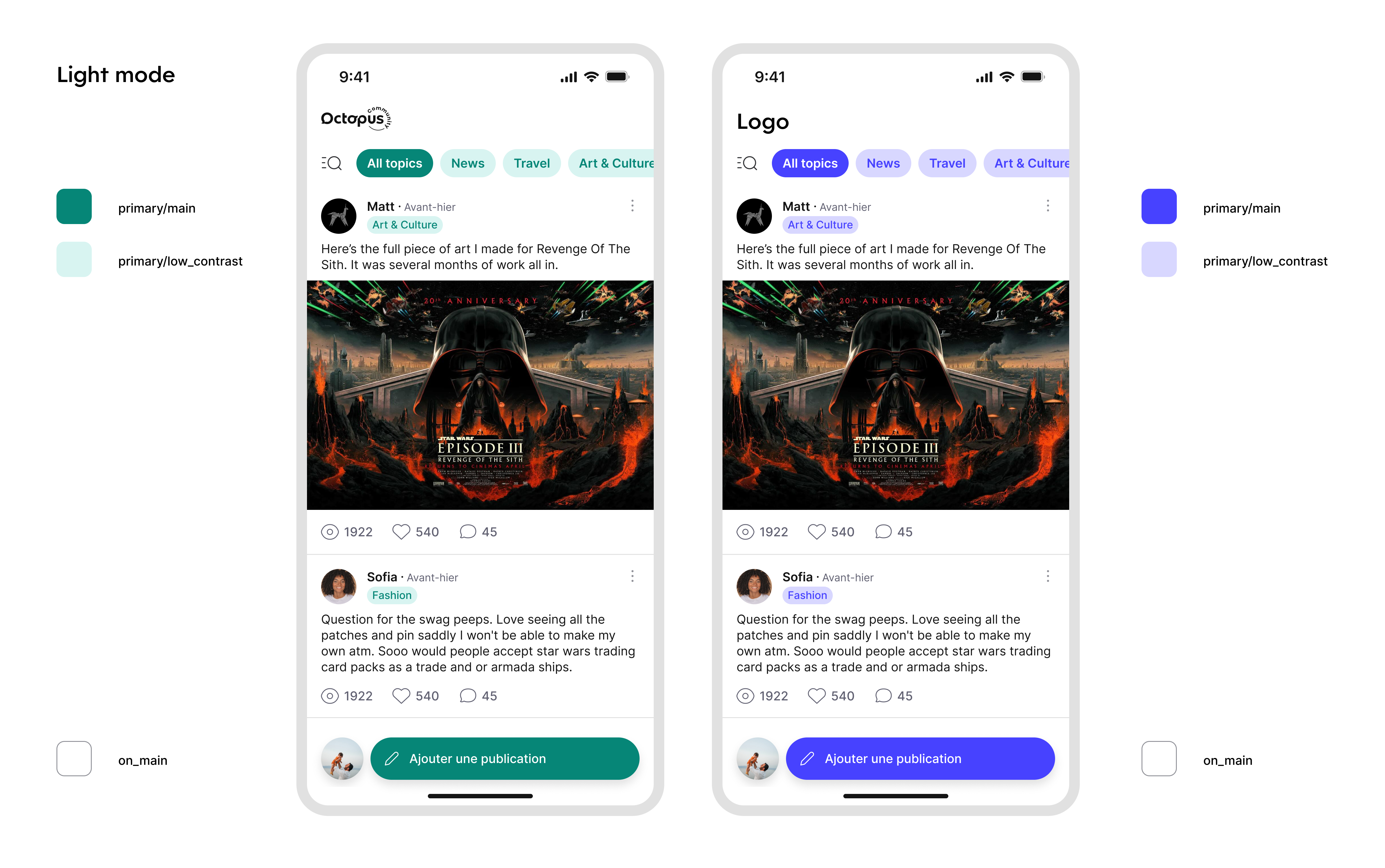
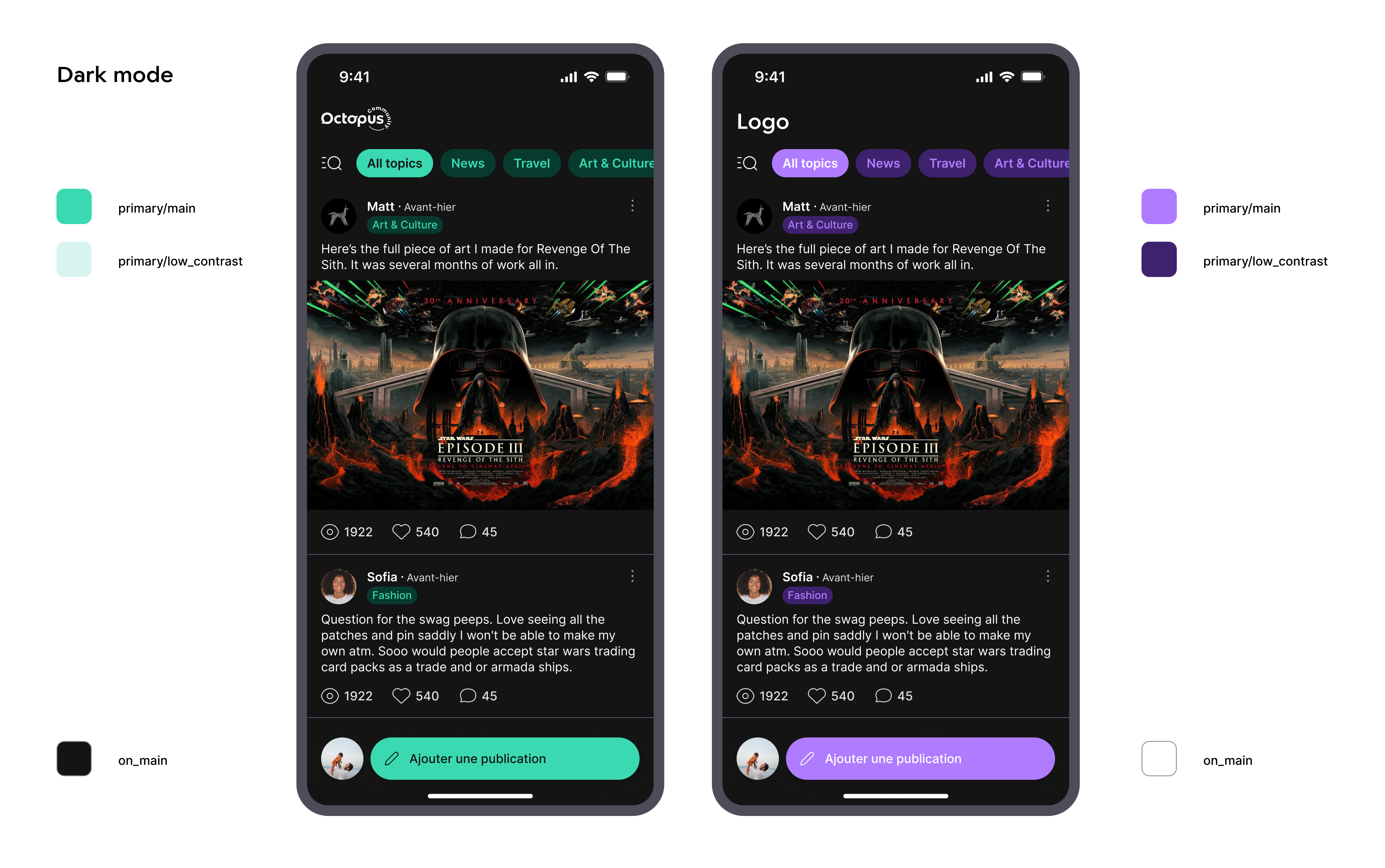
- the primary colors (a main color, a low contrast and a high contrast variations of the main color). If you do not pass a custom value for it, black/white default values will be used.
- the color of the elements (mostly texts) displayed over the primary color. If you do not pass a custom value for it, white/black default value will be used.
-
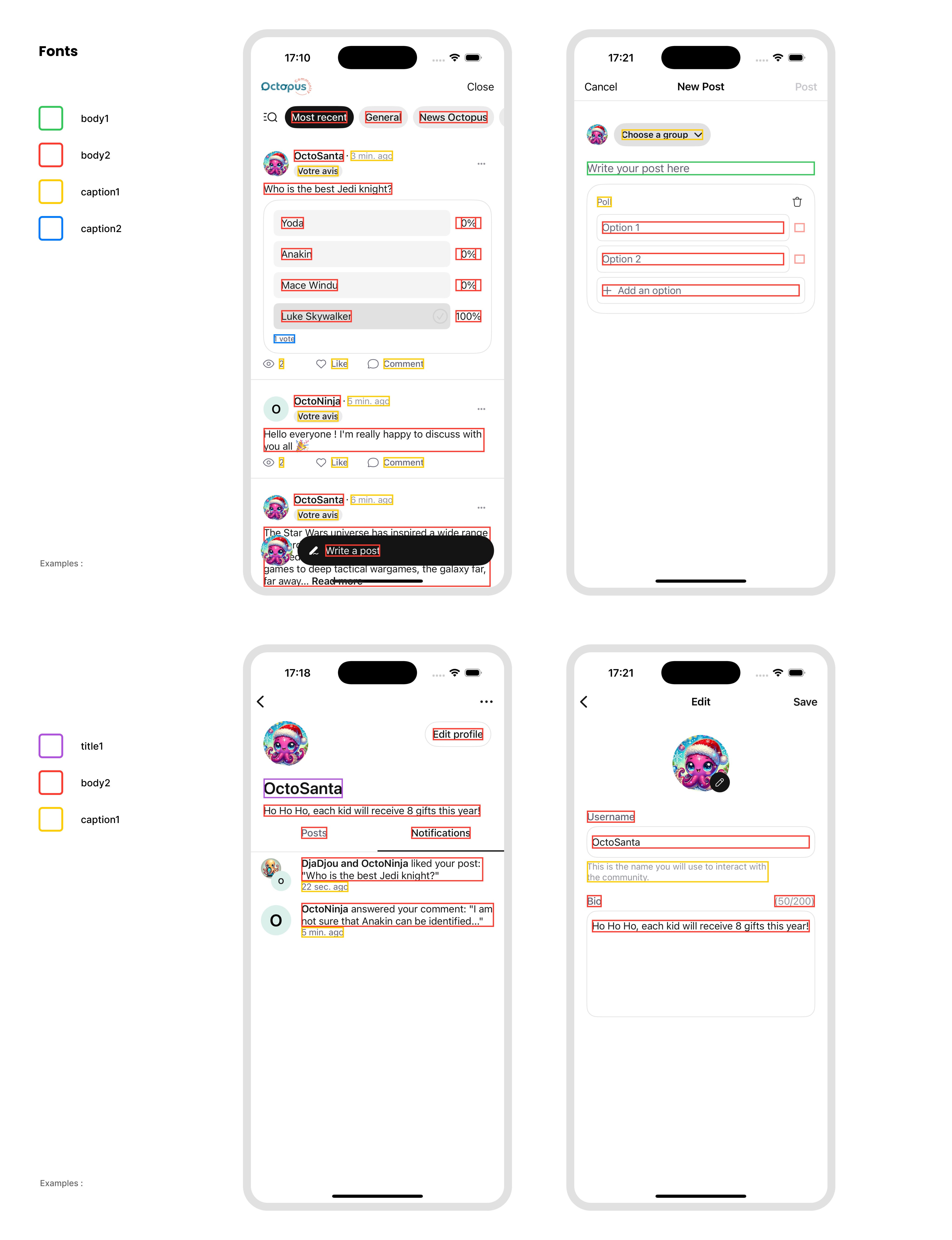
the fonts. You can customize the styles (title1, body2, caption1...) used in the sdk. If you do not pass a custom value for it, default value will be used.
-
the logo. This is an image displayed on the Octopus home page and profile creation view. If you do not pass a custom image for it, Octopus logo value will be used.
-
the icons. You can override any icon (or group of icons) used across all SDK screens to match your app's design language. If you do not pass a custom value for it, the SDK's built-in icons will be used.
-
the TopAppBar. You can customize the title, alignment, and nav-bar background color. Each platform configures this differently — see the Customize the TopAppBar subsection below.
- Android
- iOS
- Flutter
- React Native
- Unity
By default, Octopus will rely on your application's MaterialTheme.colorScheme, but you can customize the UI more precisely by surrounding composables with the OctopusTheme:
To do that, you can override the theme by passing it as an environment object:
octopusComposables(
    navController = navController
) { backStackEntry, content ->
    OctopusTheme(
        colorScheme = if (isSystemInDarkTheme()) {
            octopusDarkColorScheme(
                primary = yourDarkPrimaryColor, // Default: MaterialTheme.colorScheme.primary
                primaryLow = lowContrastVersionOfYourPrimaryColor, // Default: MaterialTheme.colorScheme.primaryContainer
                primaryHigh = highContrastVersionOfYourPrimaryColor, // Default: MaterialTheme.colorScheme.inversePrimary
                onPrimary = yourDarkOnPrimaryColor, // Default: MaterialTheme.colorScheme.onPrimary
                background = yourDarkBackgroundColor // Default: MaterialTheme.colorScheme.background
                // See the complete list in the sources documentation
            )
        } else {
            octopusLightColorScheme(
                primary = yourLightPrimaryColor, // Default: MaterialTheme.colorScheme.primary
                primaryLow = lowContrastVersionOfYourPrimaryColor, // Default: MaterialTheme.colorScheme.primaryContainer
                primaryHigh = highContrastVersionOfYourPrimaryColor, // Default: MaterialTheme.colorScheme.inversePrimary
                onPrimary = yourLightOnPrimaryColor, // Default: MaterialTheme.colorScheme.onPrimary
                background = yourLightBackgroundColor // Default: MaterialTheme.colorScheme.background
                // See the complete list in the sources documentation
            )
        },
        typography = OctopusTypographyDefaults.typography(
            title1 = yourCustomTitle1Style, // Default: TextStyle(fontSize = 26.sp)
            title2 = yourCustomTitle2Style  // Default: TextStyle(fontSize = 22.sp)
            // See the complete list in the sources documentation
        ),
        images = OctopusImagesDefaults.images(
            logo = painterResource(R.drawable.your_custom_logo), // Default: null
            icons = OctopusIconsDefaults.icons(
                // Override any icon or icon group here
            )
        )
        // ... Check the complete parameters list in the sources documentation
    ) {
        content()
    }
}
Use the OctopusThemeGenerator to configure your Community theme with a live preview of the various Octopus screens.
All parameters of the theme have default values. Only override the ones that you want to customize. In the following example, you are creating an OctopusTheme with default colors, default fonts except for the title1, and a custom logo:
OctopusTheme(
    typography = OctopusTypographyDefaults.typography(
        title1 = TextStyle(fontFamily = FontFamily.SansSerif, fontSize = 24.sp)
    ),
    images = OctopusImagesDefaults.images(
        logo = painterResource(R.drawable.your_custom_logo)
    )
) {
    OctopusHomeContent(...)
}
To do that, you can override the theme by passing it as an environment object:
OctopusHomeScreen(octopus: octopus)
    .environment(
        \.octopusTheme,
        OctopusTheme(
            colors: .init(
                primarySet: OctopusTheme.Colors.ColorSet(
                    main: yourPrimaryColor,
                    lowContrast: lowContrastVersionOfYourPrimaryColor,
                    highContrast: highContrastVersionOfYourPrimaryColor
                ),
                onPrimary: contentOverPrimaryColor
            ),
            fonts: .init(
                title1: Font.custom("Courier New", size: 26),
                title2: Font.custom("Courier New", size: 20),
                body1: Font.custom("Courier New", size: 17),
                body2: Font.custom("Courier New", size: 14),
                caption1: Font.custom("Courier New", size: 12),
                caption2: Font.custom("Courier New", size: 10),
                navBarItem: Font.custom("Courier New", size: 17)
            ),
            assets: .init(
                logo: yourLogoAsUIImage,
                icons: .init(
                    common: .init(close: UIImage(named: "close"))
                )
            )
        )
    )
All parameters of the theme have default values. Only override the ones that you want to customize. In the following example, you are creating an OctopusTheme with default colors, default fonts except for the title1, default icons and a custom logo:
let octopusTheme = OctopusTheme(
    fonts: .init(
        title1: Font.custom("Courier New", size: 26)
    ),
    assets: .init(logo: yourLogoAsUIImage)
)
If your app supports only light or dark mode, add UIUserInterfaceStyle to your Info.plist with the value Light or Dark to force the SDK to use the mode you specified.
You can customize the Octopus theme by passing an OctopusTheme to the OctopusHomeScreen widget or showOctopusHomeScreen():
OctopusHomeScreen(
    theme: OctopusTheme(
        primaryMain: Color(0xFF6200EE),
        primaryLowContrast: Color(0xFFBB86FC),
        primaryHighContrast: Color(0xFF3700B3),
        onPrimary: Colors.white,
        fontSizeTitle1: 26,
        fontSizeTitle2: 22,
        fontSizeBody1: 17,
        fontSizeBody2: 14,
        fontSizeCaption1: 12,
        fontSizeCaption2: 10,
        logoBase64: yourBase64EncodedLogo, // String? - base64 encoded image
        themeMode: OctopusThemeMode.dark, // OctopusThemeMode.light or .dark; omit to follow the system
    ),
)
All parameters of the theme have default values. Only override the ones that you want to customize. In the following example, you are creating an OctopusTheme with default colors, default font sizes except for the title1, and a custom logo:
OctopusTheme(
    fontSizeTitle1: 24,
    logoBase64: yourBase64EncodedLogo,
)
Use the themeMode parameter to control light/dark mode: set it to OctopusThemeMode.light or OctopusThemeMode.dark to force a specific mode. Leave it unset (the default) to follow the system setting.
Pass a theme object inside the initialize() call. The theme supports colors, fonts, and a logo.
You can pass a single color set (applied to both light and dark modes) or separate sets for each mode:
import { initialize } from '@octopus-community/react-native';
import { Image } from 'react-native';

await initialize({
    apiKey: 'YOUR_API_KEY',
    connectionMode: { type: 'sso', appManagedFields: [] },
    theme: {
        colors: {
            light: {
                primary: '#FF6B35',
                primaryLowContrast: '#FFB899',
                primaryHighContrast: '#CC4400',
                onPrimary: '#FFFFFF',
            },
            dark: {
                primary: '#FF8F5E',
                primaryLowContrast: '#CC7244',
                primaryHighContrast: '#FFB899',
                onPrimary: '#1A1A1A',
            },
        },
        fonts: {
            textStyles: {
                title1: { fontType: 'serif', fontSize: { size: 26 } },
                title2: { fontType: 'default', fontSize: { size: 22 } },
                body1: { fontSize: { size: 17 } },
                body2: { fontSize: { size: 14 } },
                caption1: { fontSize: { size: 12 } },
                caption2: { fontSize: { size: 10 } },
            },
        },
        logo: {
            image: Image.resolveAssetSource(require('./assets/logo.png')),
        },
    },
});
The React Native SDK automatically follows the device's system appearance (light or dark mode). There is no SDK-level colorScheme override — to control appearance, provide separate light and dark color sets as shown above, and the SDK will select the appropriate set based on the system setting.
All parameters of the theme have default values. Only override the ones that you want to customize. In the following example, you are creating an OctopusTheme with default colors, default fonts except for the title1, and a custom logo:
await initialize({
    apiKey: 'YOUR_API_KEY',
    connectionMode: { type: 'sso', appManagedFields: [] },
    theme: {
        fonts: {
            textStyles: {
                title1: { fontType: 'serif', fontSize: { size: 24 } },
            },
        },
        logo: {
            image: Image.resolveAssetSource(require('./assets/logo.png')),
        },
    },
});
Unity supports two ways to theme the SDK.
Option 1 — Unity Editor (no code)
Open Octopus SDK > Theme Configuration from the Unity menu bar. Colors, logos, and fonts selected in this window are automatically imported as native Android/iOS resources at build time.
Option 2 — Runtime API (OctopusSDK.SetTheme)
OctopusSDK.SetTheme(
    colorScheme: new OctopusColorScheme(
        primary:     new Color32(255, 0, 0, 255),
        primaryLow:  new Color32(255, 179, 179, 255),
        primaryHigh: new Color32(204, 0, 0, 255),
        onPrimary:   new Color32(255, 255, 255, 255)
    ),
    logo: new OctopusLogo(
        androidDrawableName: "my_logo",
        iOSResourceName: "Data/Raw/my_logo.png"
    ),
    fonts: new OctopusFonts(
        title1: new OctopusFont("onest_extralight", "Onest-ExtraLight", 18),
        title2: new OctopusFont("onest_extralight", "Onest-ExtraLight", 12)
    )
);
Logos and fonts are not standard Unity assets. If you use the runtime API you must add the underlying native resources (Android drawables, iOS bundle resources) yourself. The Editor-based option does this automatically.
Here is a summary of the impacts of the theme you choose:
Here is a summary of the text styles used in the main screens of the SDK:
Customize Icons ≥ 1.10.0
All icons used inside the Octopus Community UI can be replaced with your own assets. Icons will be automatically tinted by the SDK — the colors of your assets will be ignored. Icons should ideally be 24×24 pixels with drawn content of 14.5×14.5 (i.e. 4.75 px transparent border on each side) and square. If your icon is not square, it will be displayed in fit mode and may appear smaller than expected.
If you do not override an icon, the SDK default will be used.
Icons are organized into groups matching different areas of the UI: groups, content (posts, comments, replies, video, polls), profile, gamification, settings, and common (radio buttons, checkboxes, toggles, close, more actions).
As the icons are linked to the UI and the UI can change quite often, this API might change often, some icons won't be used anymore and will be quickly deprecated.
- Android
- iOS
- Flutter
- Unity
Icons are organized in a hierarchy under OctopusIcons. The structure mirrors the UI areas: groups, content (posts, comments, replies, video, polls), profile, notifications, gamification, and settings. Cross-cutting icons (radio, checkbox, toggle, close, moreActions, report, cellNavIndicator) live at the top level of OctopusIcons directly — Android does not group them under a common namespace.
All icon parameters are optional — only specify the ones you want to change. Pass the custom theme to the SDK by wrapping the Octopus composable in an OctopusTheme:
import com.octopuscommunity.sdk.ui.OctopusIconsDefaults
import com.octopuscommunity.sdk.ui.OctopusImagesDefaults
import com.octopuscommunity.sdk.ui.OctopusTheme

OctopusTheme(
    images = OctopusImagesDefaults.images(
        icons = OctopusIconsDefaults.icons(/* … */)
    )
) {
    OctopusHomeContent(/* … */)
}
Override icons within a specific group
You can customize only the icons you need. Unspecified parameters keep SDK defaults. For example, to customize some post creation icons:
import com.octopuscommunity.sdk.ui.OctopusIconsDefaults
import com.octopuscommunity.sdk.ui.OctopusImagesDefaults
import com.octopuscommunity.sdk.ui.OctopusTheme

OctopusTheme(
    images = OctopusImagesDefaults.images(
        icons = OctopusIconsDefaults.icons(
            content = OctopusIconsDefaults.content(
                post = OctopusIconsDefaults.post(
                    creation = OctopusIconsDefaults.postCreation(
                        create = painterResource(R.drawable.your_create_post_icon),
                        addPicture = painterResource(R.drawable.your_add_picture_icon),
                        addPoll = painterResource(R.drawable.your_add_poll_icon)
                    )
                )
            )
        )
    )
) {
    OctopusHomeContent(...)
}
Convenience parameters (shared icons)
Some icons share the same meaning across different parts of the UI (for example, the "report" icon appears in both content and profile contexts). To make it easy to replace all related icons at once, the OctopusIconsDefaults.icons() and OctopusIconsDefaults.content() helpers provide top-level parameters that propagate to nested groups:
OctopusIconsDefaults.icons()provides:report→ applies tocontent.reportandprofile.reportclose→ applies tocontent.deletePicture(which itself propagates topost.creation.deletePicture,comment.creation.deletePictureandreply.creation.deletePicture)
OctopusIconsDefaults.content()provides:notAvailable→ applies topost.notAvailableandcomment.notAvailablelikeNotSelected→ applies topost.likeNotSelected,comment.likeNotSelectedandreply.likeNotSelectedaddPicture→ applies topost.creation.addPicture,comment.creation.addPictureandreply.creation.addPicturedeletePicture→ applies topost.creation.deletePicture,comment.creation.deletePictureandreply.creation.deletePicturesend→ applies tocomment.creation.createandreply.creation.createopenResponseCreation→ applies topost.openCommentCreationandcomment.openReplyCreation
Individual icon overrides always take priority over convenience parameters.
Example — replace the report icon everywhere with a single line:
import com.octopuscommunity.sdk.ui.OctopusIconsDefaults
import com.octopuscommunity.sdk.ui.OctopusImagesDefaults
import com.octopuscommunity.sdk.ui.OctopusTheme

OctopusTheme(
    images = OctopusImagesDefaults.images(
        icons = OctopusIconsDefaults.icons(
            report = painterResource(R.drawable.your_custom_report_icon)
        )
    )
) {
    OctopusHomeContent(...)
}
Example — set a default "add picture" icon for all creation forms, but override it specifically for post creation:
import com.octopuscommunity.sdk.ui.OctopusIconsDefaults
import com.octopuscommunity.sdk.ui.OctopusImagesDefaults
import com.octopuscommunity.sdk.ui.OctopusTheme

OctopusTheme(
    images = OctopusImagesDefaults.images(
        icons = OctopusIconsDefaults.icons(
            content = OctopusIconsDefaults.content(
                post = OctopusIconsDefaults.post(
                    creation = OctopusIconsDefaults.postCreation(
                        addPicture = painterResource(R.drawable.my_post_add_picture)
                    )
                ),
                // Applies to comment and reply creation (but not post, since it's overridden above)
                addPicture = painterResource(R.drawable.my_generic_add_picture)
            )
        )
    )
) {
    OctopusHomeContent(...)
}
Customize radio, checkbox, and toggle icons
By default, the SDK uses native Material3 RadioButton, Checkbox, and Switch widgets. You can replace them with custom icon pairs by providing an OctopusIcons.OnOff instance:
import com.octopuscommunity.sdk.ui.OctopusIcons
import com.octopuscommunity.sdk.ui.OctopusIconsDefaults
import com.octopuscommunity.sdk.ui.OctopusImagesDefaults
import com.octopuscommunity.sdk.ui.OctopusTheme

OctopusTheme(
    images = OctopusImagesDefaults.images(
        icons = OctopusIconsDefaults.icons(
            radio = OctopusIcons.OnOff(
                on = painterResource(R.drawable.your_radio_selected),
                off = painterResource(R.drawable.your_radio_unselected)
            ),
            checkbox = OctopusIcons.OnOff(
                on = painterResource(R.drawable.your_checkbox_checked),
                off = painterResource(R.drawable.your_checkbox_unchecked)
            ),
            toggle = OctopusIcons.OnOff(
                on = painterResource(R.drawable.your_toggle_on),
                off = painterResource(R.drawable.your_toggle_off)
            )
        )
    )
) {
    OctopusHomeContent(...)
}
When radio, checkbox, or toggle is null (the default), the native Material3 component is used. Pass an OctopusIcons.OnOff instance to replace it with your custom painters.
Customize reaction images ≥ 1.11.0
The reaction images displayed on posts, comments, and replies (heart, joy, mouthOpen, clap, cry, rage) can be replaced individually. Like the other icons, all parameters are optional — only specify the ones you want to change, and unspecified ones keep the SDK defaults.
Unlike other icons, reaction images are rendered with their original colors — they are not tinted by the SDK. Provide assets that already match your visual identity (color, shading, etc.).
Each replacement image must visually match the meaning of the reaction it represents. The reaction's display name (heart → "Like", joy → "Haha", mouthOpen → "Wow", clap → "Celebrate", cry → "Sad", rage → "Angry") appears as text alongside the image in some surfaces, and is used as the content description read by TalkBack. For example, replacing cry with a party 🎉 image would show a party icon labelled "Sad" — confusing on screen and misleading for accessibility users.
import com.octopuscommunity.sdk.ui.OctopusIconsDefaults
import com.octopuscommunity.sdk.ui.OctopusImagesDefaults
import com.octopuscommunity.sdk.ui.OctopusTheme

OctopusTheme(
    images = OctopusImagesDefaults.images(
        icons = OctopusIconsDefaults.icons(
            content = OctopusIconsDefaults.content(
                reaction = OctopusIconsDefaults.reaction(
                    heart = { painterResource(R.drawable.my_heart_reaction) },
                    joy = { painterResource(R.drawable.my_joy_reaction) },
                    mouthOpen = { painterResource(R.drawable.my_mouth_open_reaction) },
                    clap = { painterResource(R.drawable.my_clap_reaction) },
                    cry = { painterResource(R.drawable.my_cry_reaction) },
                    rage = { painterResource(R.drawable.my_rage_reaction) }
                )
            )
        )
    )
) {
    OctopusHomeContent(...)
}
Full icon customization example
You can combine all the above into a single OctopusTheme setup:
import com.octopuscommunity.sdk.ui.OctopusIcons
import com.octopuscommunity.sdk.ui.OctopusIconsDefaults
import com.octopuscommunity.sdk.ui.OctopusImagesDefaults
import com.octopuscommunity.sdk.ui.OctopusTheme

OctopusTheme(
    images = OctopusImagesDefaults.images(
        logo = painterResource(R.drawable.your_custom_logo),
        icons = OctopusIconsDefaults.icons(
            close = painterResource(R.drawable.your_close_icon),
            moreActions = painterResource(R.drawable.your_more_actions_icon),
            report = painterResource(R.drawable.your_report_icon),
            content = OctopusIconsDefaults.content(
                addPicture = painterResource(R.drawable.your_add_picture_icon)
            ),
            profile = OctopusIconsDefaults.profile(
                defaultAvatar = painterResource(R.drawable.your_default_avatar)
            ),
            radio = OctopusIcons.OnOff(
                on = painterResource(R.drawable.your_radio_on),
                off = painterResource(R.drawable.your_radio_off)
            ),
            checkbox = OctopusIcons.OnOff(
                on = painterResource(R.drawable.your_checkbox_on),
                off = painterResource(R.drawable.your_checkbox_off)
            ),
            toggle = OctopusIcons.OnOff(
                on = painterResource(R.drawable.your_toggle_on),
                off = painterResource(R.drawable.your_toggle_off)
            )
        )
    )
) {
    OctopusHomeContent(...)
}
Icons are organized in a hierarchy under OctopusTheme.Assets.Icons. The structure mirrors the UI areas: groups, content (posts, comments, replies, video, polls), profile, gamification, settings, and common (radio buttons, checkboxes, toggles, close, more actions).
All icon parameters are optional UIImage? — only specify the ones you want to change. Pass the custom theme to the SDK using the .environment modifier:
OctopusUIView(octopus: octopus)
    .environment(\.octopusTheme, myCustomTheme)
Override icons within a specific group
You can customize only the icons you need. Unspecified parameters keep SDK defaults. For example, to customize some post creation icons:
import OctopusUI

let theme = OctopusTheme(
    assets: .init(
        icons: .init(
            content: .init(
                post: .init(
                    creation: .init(
                        open: UIImage(named: "myCreatePostIcon"),
                        addPoll: UIImage(named: "myAddPollIcon")
                    ),
                    commentCount: UIImage(named: "myCommentCountIcon")
                ),
                delete: UIImage(named: "myDeleteIcon")
            )
        )
    )
)
Convenience parameters (shared icons)
Some icons share the same meaning across different parts of the UI (for example, the "report" icon appears in both content and profile contexts). To make it easy to replace all related icons at once, the Icons and Content initializers provide convenience parameters:
Icons.initprovidesdefaultReport: when set, it applies to bothcontent.reportandprofile.report— unless you override those individually.Content.initprovides:defaultNotAvailable→ applies topost.notAvailableandcomment.notAvailabledefaultLikeNotSelected→ applies topost.likeNotSelected,comment.likeNotSelectedandreply.likeNotSelecteddefaultAddPicture→ applies topost.creation.addPicture,comment.creation.addPicture, andreply.creation.addPicturedefaultDeletePicture→ applies topost.creation.deletePicture,comment.creation.deletePicture, andreply.creation.deletePicturedefaultCreateResponse→ applies tocomment.creation.createandreply.creation.createdefaultOpenResponseCreation→ applies tocomment.creation.openandreply.creation.open
Individual icon overrides always take priority over convenience parameters.
Example — replace the report icon everywhere with a single line:
import OctopusUI

let theme = OctopusTheme(
    assets: .init(
        icons: .init(
            defaultReport: UIImage(named: "myReportIcon")
        )
    )
)
Example — set a default "add picture" icon for all creation forms, but override it specifically for post creation:
import OctopusUI

let theme = OctopusTheme(
    assets: .init(
        icons: .init(
            content: .init(
                post: .init(
                    creation: .init(
                        addPicture: UIImage(named: "myPostAddPictureIcon")
                    )
                ),
                // Applies to comment and reply creation (but not post, since it's overridden above)
                defaultAddPicture: UIImage(named: "myGenericAddPictureIcon")
            )
        )
    )
)
Customize radio, checkbox, and toggle icons
The common group contains OnOff components for radio buttons, checkboxes, and toggles. Unlike other icons, OnOff requires two non-optional UIImage parameters (on and off):
import OctopusUI

let theme = OctopusTheme(
    assets: .init(
        icons: .init(
            common: .init(
                radio: .init(
                    on: UIImage(named: "myRadioOnIcon")!,
                    off: UIImage(named: "myRadioOffIcon")!
                ),
                checkbox: .init(
                    on: UIImage(named: "myCheckboxOnIcon")!,
                    off: UIImage(named: "myCheckboxOffIcon")!
                ),
                toggle: .init(
                    on: UIImage(named: "myToggleOnIcon")!,
                    off: UIImage(named: "myToggleOffIcon")!
                )
            )
        )
    )
)
Customize reaction images ≥ 1.11.0
The reaction images displayed on posts, comments, and replies (heart, joy, mouthOpen, clap, cry, rage) can be replaced individually. Like the other icons, all parameters are optional — only specify the ones you want to change, and unspecified ones keep the SDK defaults.
Unlike other icons, reaction images are rendered with their original colors — they are not tinted by the SDK. Provide assets that already match your visual identity (color, shading, etc.).
Each replacement image must visually match the meaning of the reaction it represents. The reaction's display name (heart → "Like", joy → "Haha", mouthOpen → "Wow", clap → "Celebrate", cry → "Sad", rage → "Angry") appears as text alongside the image in some surfaces, and is used as the accessibility label read by VoiceOver. For example, replacing cry with a party 🎉 image would show a party icon labelled "Sad" — confusing on screen and misleading for VoiceOver users.
import OctopusUI

let theme = OctopusTheme(
    assets: .init(
        icons: .init(
            content: .init(
                reaction: .init(
                    heart: UIImage(named: "myHeartReaction"),
                    joy: UIImage(named: "myJoyReaction"),
                    mouthOpen: UIImage(named: "myMouthOpenReaction"),
                    clap: UIImage(named: "myClapReaction"),
                    cry: UIImage(named: "myCryReaction"),
                    rage: UIImage(named: "myRageReaction")
                )
            )
        )
    )
)
Full icon customization example
You can customize icons across all groups in a single OctopusTheme:
import OctopusUI

let icons = OctopusTheme.Assets.Icons(
    groups: .init(
        openList: UIImage(named: "myGroupListIcon"),
        selected: UIImage(named: "myGroupSelectedIcon")
    ),
    content: .init(
        post: .init(
            creation: .init(
                open: UIImage(named: "myCreatePostIcon"),
                topicSelection: UIImage(named: "myTopicArrowIcon"),
                addPicture: UIImage(named: "myPostAddPictureIcon"),
                deletePicture: UIImage(named: "myPostDeletePictureIcon"),
                addPoll: UIImage(named: "myAddPollIcon"),
                addPollOption: UIImage(named: "myAddPollOptionIcon"),
                deletePoll: UIImage(named: "myDeletePollIcon"),
                deletePollOption: UIImage(named: "myDeletePollOptionIcon")
            ),
            emptyFeedInGroups: UIImage(named: "myEmptyGroupFeedIcon"),
            emptyFeedInCurrentUserProfile: UIImage(named: "myEmptyCurrentUserFeedIcon"),
            emptyFeedInOtherUserProfile: UIImage(named: "myEmptyOtherUserFeedIcon"),
            notAvailable: UIImage(named: "myPostNotAvailableIcon"),
            commentCount: UIImage(named: "myCommentCountIcon"),
            viewCount: UIImage(named: "myViewCountIcon"),
            moreReactions: UIImage(named: "myMoreReactionsIcon"),
            likeNotSelected: UIImage(named: "myPostLikeIcon"),
            moderated: UIImage(named: "myPostModerated")

        ),
        comment: .init(
            creation: .init(
                open: UIImage(named: "myOpenCommentCreationIcon"),
                create: UIImage(named: "mySendCommentIcon"),
                addPicture: UIImage(named: "myCommentAddPictureIcon"),
                deletePicture: UIImage(named: "myCommentDeletePictureIcon")
            ),
            emptyFeed: UIImage(named: "myNoCommentsIcon"),
            notAvailable: UIImage(named: "myCommentNotAvailableIcon"),
            seeReply: UIImage(named: "mySeeReplyIcon"),
            likeNotSelected: UIImage(named: "myCommentLikeIcon")
        ),
        reply: .init(
            creation: .init(
                open: UIImage(named: "myOpenReplyCreationIcon"),
                create: UIImage(named: "mySendReplyIcon"),
                addPicture: UIImage(named: "myReplyAddPictureIcon"),
                deletePicture: UIImage(named: "myReplyDeletePictureIcon")
            ),
            likeNotSelected: UIImage(named: "myReplyLikeIcon")
        ),
        video: .init(
            muted: UIImage(named: "myMutedIcon"),
            notMuted: UIImage(named: "myNotMutedIcon"),
            pause: UIImage(named: "myPauseIcon"),
            play: UIImage(named: "myPlayIcon"),
            replay: UIImage(named: "myReplayIcon")
        ),
        poll: .init(
            selectedOption: UIImage(named: "myCheckIcon")
        ),
        reaction: .init(
            heart: UIImage(named: "myHeartReaction"),
            joy: UIImage(named: "myJoyReaction"),
            mouthOpen: UIImage(named: "myMouthOpenReaction"),
            clap: UIImage(named: "myClapReaction"),
            cry: UIImage(named: "myCryReaction"),
            rage: UIImage(named: "myRageReaction")
        ),
        delete: UIImage(named: "myDeleteIcon"),
        report: UIImage(named: "myContentReportIcon")
    ),
    profile: .init(
        addPicture: UIImage(named: "myAddAvatarIcon"),
        editPicture: UIImage(named: "myEditAvatarIcon"),
        addBio: UIImage(named: "myAddBioIcon"),
        emptyNotifications: UIImage(named: "myNoNotificationsIcon"),
        report: UIImage(named: "myProfileReportIcon"),
        notConnected: UIImage(named: "myNotConnectedIcon"),
        blockUser: UIImage(named: "myBlockUserIcon")
    ),
    gamification: .init(
        badge: UIImage(named: "myBadgeIcon"),
        info: UIImage(named: "myGamificationInfoIcon"),
        rulesHeader: UIImage(named: "myRulesHeaderIcon")
    ),
    settings: .init(
        account: UIImage(named: "myAccountIcon"),
        help: UIImage(named: "myHelpIcon"),
        info: UIImage(named: "myInfoIcon"),
        logout: UIImage(named: "myLogoutIcon"),
        deleteAccountWarning: UIImage(named: "myDeleteAccountIcon")
    ),
    common: .init(
        radio: .init(
            on: UIImage(named: "myRadioOnIcon")!,
            off: UIImage(named: "myRadioOffIcon")!
        ),
        checkbox: .init(
            on: UIImage(named: "myCheckboxOnIcon")!,
            off: UIImage(named: "myCheckboxOffIcon")!
        ),
        toggle: .init(
            on: UIImage(named: "myToggleOnIcon")!,
            off: UIImage(named: "myToggleOffIcon")!
        ),
        close: UIImage(named: "myCloseIcon"),
        moreActions: UIImage(named: "myMoreActionsIcon"),
        listCellNavIndicator: UIImage(named: "myListCellNavIndicatorIcon")
    )
)

let theme = OctopusTheme(
    assets: .init(icons: icons)
)
In this full example, report is set individually on content and profile. You could instead use defaultReport at the Icons level to apply the same report icon to both (see Convenience parameters above).
The account, logout, and deleteAccountWarning icons inside settings are only displayed when using Octopus authentication mode. They are not shown in SSO mode.
Icon customization is not yet available on Flutter.
Customize reaction images
Per-reaction image overrides are not yet available on Flutter.
Icon customization is not yet available on Unity.
Customize the TopAppBar
- Android
- iOS
- Flutter
- React Native
- Unity
You can customize the title displayed in the navigation bar on the main feed screen directly from the OctopusHomeScreen composable. It accepts three parameters for this:
titleText: an optionalStringthat overrides the title text shown in the nav bar. Whennull(default), falls back to the SDK default title (or nothing if a logo is displayed). We highly recommend keeping the text under 18 characters for best results.titleCentered: iftrue, the title is centered in the nav bar. Iffalse(default), the title is left-aligned (leading).logo: an optional@Composable () -> Painterthat provides a custom logo to display in the nav bar. Whennull(default), the logo from yourOctopusThemeis used.
Here is how to display a leading text title:
OctopusHomeScreen(
    navController = navController,
    titleText = "App Name",
    titleCentered = false
)
And here is how to display a centered logo:
OctopusHomeScreen(
    navController = navController,
    titleCentered = true,
    logo = { painterResource(R.drawable.your_logo) }
)
To show a host-driven leading navigation icon on the home root — for example a Close icon when you present OctopusHomeScreen inside a modal / bottom sheet and need a dismiss affordance — pass leadingNavigationIcon (NavigationIconType.Close or NavigationIconType.Back). It fires onBack on tap and overrides backIcon when set. This is the Android counterpart to the iOS navBarLeadingAction.
OctopusHomeScreen(
    navController = navController,
    leadingNavigationIcon = NavigationIconType.Close, // or NavigationIconType.Back
    onBack = { /* dismiss your modal / pop your route */ },
)
For more advanced customization of the TopAppBar (colors, navigation icons, text styles), you can provide your own OctopusTopAppBar configuration at the theme level. See the Advanced Screen-Based Theming section below.
You can customize the title displayed in the navigation bar on the main feed screen using OctopusMainFeedTitle. This struct lets you control both the content and the placement of the title.
The OctopusHomeScreen constructor accepts two parameters for this:
mainFeedNavBarTitle: an optionalOctopusMainFeedTitlethat defines what is shown in the nav bar. Whennil(default), nothing is displayed. It has two properties:content— either.logoto display the logo from yourOctopusTheme(see Modify the theme), or.text(TextTitle)to display a text. We highly recommend keeping the text under 18 characters for best results. If set to.logoand no custom logo is set in yourOctopusTheme, the title slot is empty regardless of placement.placement— either.leading(left-aligned) or.center(centered).
mainFeedColoredNavBar: iftrue, the navigation bar background uses the primary theme color (see Modify the theme). Requires iOS 16+; on earlier versions this parameter is ignored. Default isfalse.
Here is how to display a leading text title with a colored nav bar:
OctopusHomeScreen(
    octopus: octopus,
    mainFeedNavBarTitle: .init(
        content: .text(.init(text: "App Name")),
        placement: .leading
    ),
    mainFeedColoredNavBar: true
)
And here is how to display a centered logo:
OctopusHomeScreen(
    octopus: octopus,
    mainFeedNavBarTitle: .init(
        content: .logo,
        placement: .center
    )
)
The navBarLeadingItem and navBarPrimaryColor parameters are deprecated. Use mainFeedNavBarTitle and mainFeedColoredNavBar instead. Existing code using the old parameters will continue to compile but will produce a deprecation warning.
To see a full example of how you can achieve that, you can follow how it is done in the Samples, in the Scenario "Custom theme".
Leading navigation button
OctopusHomeScreen's built-in close button is only shown when the view is presented natively via .sheet or .fullScreenCover. When you push OctopusHomeScreen onto your own UINavigationController stack, or mount it inside a Flutter / React Native plugin via UIHostingController, no dismiss affordance is provided. In those cases, pass navBarLeadingAction to show a host-driven button in the leading nav-bar slot of the root screen.
Two cases are available:
.close(onTap:)— renders the SDK's close icon (e.g. for a modally-presented host container that is not a native SwiftUI sheet)..back(onTap:)— renders a back chevron (e.g. for a host navigation route where the SDK is pushed).
The closure fires instead of dismissing a SwiftUI presentation — it is the host's responsibility to pop its route or dismiss its container.
Close button for a UIKit/hybrid modal host:
OctopusHomeScreen(
    octopus: octopus,
    navBarLeadingAction: .close(onTap: {
        // Dismiss your UIViewController or hybrid modal here
    })
)
Back button when pushed on a UINavigationController:
OctopusHomeScreen(
    octopus: octopus,
    navBarLeadingAction: .back(onTap: {
        // Pop your UINavigationController or hybrid route here
    })
)
When navBarLeadingAction is nil (the default), behavior is unchanged — the SDK renders its own close button when presentationMode.isPresented is true (i.e. inside a .sheet or .fullScreenCover). Pass navBarLeadingAction only when the SDK is hosted outside a native SwiftUI presentation context.
When navBarLeadingAction is set alongside mainFeedNavBarTitle, the leading slot is occupied by the action button and the feed title is automatically repositioned to the centered slot — it is not lost.
You can customize the navigation bar of the Octopus UI by passing parameters to the OctopusHomeScreen widget:
OctopusHomeScreen(
    navBarTitle: "My Community", // Short text title (less than 18 characters)
    navBarPrimaryColor: true, // Use primary color as background
    showBackButton: true, // Show the back button
    onBack: () { ... },
    titleCentered: true, // ≥ 1.12.0 — center the title
    navBarLeadingAction: OctopusNavBarLeadingAction.close, // ≥ 1.12.0 — iOS-only today
    navigationMode: OctopusNavigationMode.navigationStack, // ≥ 1.12.0 — iOS-only today
)
titleCentered is honored on both Android and iOS.
navBarLeadingAction and navigationMode are wired through the iOS bridge today (wrapped iOS SDK 1.12.2+). On Android they are accepted but currently no-op — Android already keeps its modal back-stack via Compose NavHost, and the native back arrow is controlled by showBackButton, so navBarLeadingAction: .close + showBackButton: true give you a native affordance on both platforms in the meantime. Android parity is tracked in octopus-sdk-android#268.
Unlike other platforms where the TopAppBar is configured at the composable/widget level, on React Native the TopAppBar is configured once at initialization time by passing a topAppBar object to initialize().
Three optional fields are available:
title: what to show as the nav-bar title.{ type: 'logo' }— displaystheme.logo(default when omitted).{ type: 'text', text: string }— custom text. Keep under ~18 characters for best results.
alignment:'leading'(default, left-aligned) or'center'(centered title).coloredBackground:boolean(defaultfalse) — whentrue, the navigation bar background uses the theme's primary color. On iOS this requires iOS 16+ and is silently ignored on earlier versions.
Here is how to display a leading text title:
import { initialize } from '@octopus-community/react-native';

await initialize({
    apiKey: 'YOUR_API_KEY',
    connectionMode: { type: 'sso', appManagedFields: [] },
    topAppBar: {
        title: { type: 'text', text: 'My Community' },
        alignment: 'leading',
    },
});
And here is how to display a centered logo with a colored background:
import { initialize } from '@octopus-community/react-native';

await initialize({
    apiKey: 'YOUR_API_KEY',
    connectionMode: { type: 'sso', appManagedFields: [] },
    topAppBar: {
        title: { type: 'logo' },
        alignment: 'center',
        coloredBackground: true,
    },
});
TopAppBar customization is not available on Unity.
Advanced Screen-Based Theming (Android only)
- Android
- iOS
- Flutter
- React Native
- Unity
For more complex theming scenarios, you can customize any aspect of the Octopus theme (colors, typography, images, TopAppBar) based on the current screen:
octopusComposables(
    navController = navController
) { backStackEntry, content ->
    OctopusTheme(
        colorScheme = when {
            // Post Details with branded theme
            backStackEntry.destination.hasRoute<OctopusDestination.PostDetails>() -> {
                octopusColorScheme().copy(
                    background = if (isSystemInDarkTheme()) Color.Black else Color.White
                )
            }
            else -> octopusColorScheme()
        },
        topAppBar = when {
            // Home screen with custom TopAppBar theme
            backStackEntry.destination.hasRoute<OctopusDestination.Home>() -> {
                OctopusTopAppBarDefaults.topAppBar(
                    title = { text ->
                        OctopusTopAppBarTitle(text = "My Community")
                    }
                )
            }
            else -> OctopusTopAppBarDefaults.topAppBar()
        }
    ) {
        content()
    }
}
Screen-based theming is not available on iOS.
Screen-based theming is not available on Flutter.
Screen-based theming is not available on React Native.
Screen-based theming is not available on Unity.
Push Notifications ≥ 1.4.0
To increase user engagement, you can provide information to the Octopus SDK so your users can receive push notifications when other users interact with them inside the community.
Octopus SDK is not asking for push notification permissions, we let you handle that part where it makes more sense in your app.
The container the notification's destination UI appears in differs per platform, and none of them impose a modal bottom sheet: Android deep-links into your own navigation graph (you control the container); iOS gives you an isAnOctopusNotification gate plus a notificationUserInfo binding, and you present OctopusHomeScreen however you like (a .sheet, a .fullScreenCover, or pushed on your own navigation stack); Flutter pushes a full-screen route via openNotification.
- Android
- iOS
- Flutter
- React Native
- Unity
If your app does not support Push Notifications yet, you can follow the official Firebase documentation.
Our servers need your service account's private key file to be authorized to send notifications to your app on your behalf.
If you don't have this JSON file yet, follow this tutorial
- In the Firebase console, open Settings > Service Accounts
- Click Generate New Private Key, then confirm by clicking Generate Key.
- Securely store the JSON file containing the key.
More information can be found in the official Firebase documentation
Please send the json file using the online form sent by the Octopus team.
This JSON file is different from the one you are using to configure Firebase in your app (google-services.json)
Once your project is correctly set up for push notifications, you should forward the Firebase Cloud Messaging Token (FCM Token) to the Octopus SDK:
class MessagingService : FirebaseMessagingService() {
    override fun onNewToken(token: String) {
        super.onNewToken(token)

        // Register the new token with Octopus
        OctopusSDK.registerNotificationsToken(token)
    }
}
You are in charge of requesting the Notification permission and referencing your messaging service:
<uses-permission android:name="android.permission.POST_NOTIFICATIONS" />
if (checkSelfPermission(POST_NOTIFICATIONS) != PackageManager.PERMISSION_GRANTED) {
    // Request launcher for notification permission
    registerForActivityResult(
        contract = ActivityResultContracts.RequestPermission(),
        callback = {
            FirebaseMessaging.getInstance().token.addOnCompleteListener { task ->
                if (task.isSuccessful) {
                    OctopusSDK.registerNotificationsToken(task.result)
                }
            }
        }
    ).launch(POST_NOTIFICATIONS)
}
<service
    android:name=".notifications.MessagingService"
    android:exported="false">
    <intent-filter>
        <action android:name="com.google.firebase.MESSAGING_EVENT" />
    </intent-filter>
</service>
When you receive a notification message, first check if it is an Octopus notification by calling:
override fun onMessageReceived(remoteMessage: RemoteMessage) {
    super.onMessageReceived(remoteMessage)

    val isOctopusNotification = remoteMessage.data.isOctopusNotification
    if (isOctopusNotification) {
        // ... Handle the Octopus notification here (see below)
    }
}
If it's the case, display the Octopus notification using the Notification Manager:
val octopusNotification = OctopusSDK.getOctopusNotification(data = remoteMessage.data)
if (octopusNotification != null) {
    notificationManager.notify(
        octopusNotification.id,
        Notification.Builder(this, CHANNEL_ID)
            .setSmallIcon(R.drawable.ic_stat_notification)
            .setColor(getColor(R.color.accent))
            .setAutoCancel(true)
            // Extension function to extract the title, text and deep link from the OctopusNotification
            .setOctopusContent(
                context = this,
                activityClass = MainActivity::class,
                octopusNotification = octopusNotification
            ).build()
    )
}
Then you can display the notification's targeted Octopus UI from the octopusNotification.deepLink:
intent.data?.let { uri -> navController.navigate(deepLink = uri)}
- The
activityClassmust be the one containing the compose content with theoctopusNavigation()subgraph. - The
setOctopusContentfunction is based on a deep link mechanism that will automatically launch the activity and navigate to the corresponding screen within the Octopus navigation graph. - You can also handle the content manually by using the
OctopusNotification'stitle,body, andlinkPathfields and configuring your ownPendingIntent.
If your app does not support Push Notifications yet, you can follow the official Apple documentation.
Our servers need to have a key in the .p8 format in order to send push notifications to your app on your behalf.
If you don't have this key yet, follow this tutorial
- Go to the Apple Dev Website and create a new key.
- Name it and check
Apple Push Notifications service (APNs). - Click on configure for this line and select
Sandbox & Productionin theEnvironmentmenu if you intend to have the same key for sandbox and production builds. - Download the key and be sure to store it in a secure and retrievable place.
Once you have that file, you should send it using the secure form provided by the Octopus Team, along with:
- the key ID: can be found in the list of keys on the Apple Dev Website
- your Bundle ID: can be found in your Xcode project
- your Team ID: can be found here in the
Membership detailscard
Once your project is correctly set up for push notifications, you should forward the notification device token to the Octopus SDK:
func application(_ application: UIApplication, didRegisterForRemoteNotificationsWithDeviceToken deviceToken: Data) {
    let token = deviceToken.map { String(format: "%02.2hhx", $0) }.joined()
    octopus.set(notificationDeviceToken: token)
}
You are in charge of requesting the Notification permission and registering for remote notifications:
// Request the user's authorization
let center = UNUserNotificationCenter.current()
try await center.requestAuthorization(options: [.alert, .badge, .sound])
// Register for remote notifications
UIApplication.shared.registerForRemoteNotifications()
When you receive a notification response (i.e., when the user tapped a notification), extract the userInfo dictionary and check if it is an Octopus notification:
let userInfo = notificationResponse.notification.request.content.userInfo
if OctopusSDK.isAnOctopusNotification(userInfo: userInfo) {
    // Store the userInfo and display the Octopus UI (see below)
}
If it is one, display the Octopus UI and pass the userInfo as a Binding:
OctopusHomeScreen(octopus: octopus, notificationUserInfo: $octopusNotificationUserInfo)
The notificationUserInfo binding accepts a [AnyHashable: Any]?. The SDK sets it back to nil after navigating to the notification's target screen, signaling that the notification has been consumed.
Deprecated < 1.11.0
OctopusSDK.isAnOctopusNotification(notification: notificationResponse.notification)
OctopusHomeScreen(octopus: octopus, notificationResponse: $octopusNotification)
Step 1 — Register the device token
Call registerPushNotificationToken on startup and on every token refresh. On iOS, pass the APNs device token (getAPNSToken()); on Android, pass the FCM registration token (getToken()).
import 'dart:io' show Platform;
import 'package:firebase_messaging/firebase_messaging.dart';
import 'package:octopus_sdk_flutter/octopus_sdk_flutter.dart';

final messaging = FirebaseMessaging.instance;

await messaging.requestPermission();
await _registerToken(messaging);

// The token rotates from time to time — re-register on every refresh.
// Discard the callback token — re-fetch to get the platform-correct token
// (APNs device token on iOS, FCM registration token on Android).
messaging.onTokenRefresh.listen((_) => _registerToken(messaging));

Future<void> _registerToken(FirebaseMessaging messaging) async {
  final token = Platform.isIOS
      ? await messaging.getAPNSToken()
      : await messaging.getToken();
  if (token == null || token.isEmpty) return;
  await OctopusSDK().registerPushNotificationToken(token);
}
The Octopus SDK does not request push notification permissions — your app is responsible for calling requestPermission() before registering the token.
When using firebase_messaging on iOS, always pass getAPNSToken() — not getToken() — to registerPushNotificationToken. The FCM token is different from the APNs device token; registering the FCM token will produce a successful API call but no notification delivery.
Step 2 — Detect and parse incoming notifications
When a notification arrives, check whether it comes from Octopus with OctopusSDK.isOctopusNotification(payload). The payload is a Map — on Android it is RemoteMessage.data; on iOS raw APNs it is the userInfo dict (with a nested data envelope). Both shapes are handled transparently.
If the check passes, call OctopusSDK.getOctopusNotification(payload) to get a typed OctopusNotification (fields: title, body, linkPath, optional postId / commentId / replyId). Returns null if link_path is missing.
Step 3 — Open the Octopus UI
Call openNotification to display the Octopus UI pre-navigated to the content referenced by the notification. It pushes a full-screen route (a MaterialPageRoute) hosting the community UI — not a modal bottom sheet. To present it differently (e.g. a fullscreenDialog modal), copy the inline pattern from the sample's scenarios instead of the helper:
await OctopusSDK().openNotification(
  context,
  notification,
  onNavigateToLogin: () {
    // Navigate to your app's login screen
  },
);
The onNavigateToLogin callback is required. navBarTitle, navBarPrimaryColor, theme, onModifyUser, and onNavigateToUrl are optional.
Complete example — firebase_messaging integration
import 'dart:io' show Platform;
import 'package:firebase_messaging/firebase_messaging.dart';
import 'package:flutter/material.dart';
import 'package:octopus_sdk_flutter/octopus_sdk_flutter.dart';

final navigatorKey = GlobalKey<NavigatorState>();

class MyApp extends StatefulWidget {
  const MyApp({super.key});
  @override
  State<MyApp> createState() => _MyAppState();
}

class _MyAppState extends State<MyApp> {
  final _messaging = FirebaseMessaging.instance;

  @override
  void initState() {
    super.initState();
    _setupPushNotifications();
  }

  Future<void> _setupPushNotifications() async {
    await _messaging.requestPermission();
    await _registerToken();

    // Discard the callback token — re-fetch to get the platform-correct token
    // (APNs device token on iOS, FCM registration token on Android).
    _messaging.onTokenRefresh.listen((_) => _registerToken());

    // Foreground — app is open when the notification arrives
    FirebaseMessaging.onMessage.listen(_handleNotificationTap);

    // Cold start — app was terminated when the user tapped the notification
    final initial = await _messaging.getInitialMessage();
    if (initial != null) _handleNotificationTap(initial);

    // Background tap — app was in background
    FirebaseMessaging.onMessageOpenedApp.listen(_handleNotificationTap);
  }

  Future<void> _registerToken() async {
    final token = Platform.isIOS
        ? await _messaging.getAPNSToken()
        : await _messaging.getToken();
    if (token == null || token.isEmpty) return;
    await OctopusSDK().registerPushNotificationToken(token);
  }

  void _handleNotificationTap(RemoteMessage message) {
    // Merge notification title/body into the data map so the parser
    // carries user-facing copy in the typed OctopusNotification.
    final payload = <String, Object?>{...message.data};
    final notif = message.notification;
    if (notif?.title != null) payload.putIfAbsent('title', () => notif!.title!);
    if (notif?.body != null) payload.putIfAbsent('body', () => notif!.body!);

    if (!OctopusSDK.isOctopusNotification(payload)) return;
    final notification = OctopusSDK.getOctopusNotification(payload);
    if (notification == null) return;

    final ctx = navigatorKey.currentContext;
    if (ctx == null) return;
    OctopusSDK().openNotification(
      ctx,
      notification,
      onNavigateToLogin: () {
        Navigator.of(ctx).pushNamed('/login');
      },
    );
  }

  @override
  Widget build(BuildContext context) {
    return MaterialApp(
      navigatorKey: navigatorKey,
      // ...
    );
  }
}
Step 1 — Register the device push token
Call registerPushNotificationToken at startup and on every token refresh. On iOS, pass the APNs device token (hex string); on Android, pass the FCM registration token.
- Android: use
@react-native-firebase/messaging—messaging().getToken(). - iOS: use
messaging().getAPNSToken()from@react-native-firebase/messaging, or obtain the token from a native module bridgingUNUserNotificationCenterDelegate.
For iOS apps that do not use Firebase, handling notification taps (cold-start and background) requires a dedicated native module. The SDK repository includes reference native code in ios/OctopusReactNativeSdkExample/OctopusPushModule.swift and AppDelegate.swift that you can use as a starting point.
No prior connectUser() is required — the token is associated with the user when connectUser is later called and re-associated on user change.
On iOS, always pass the APNs device token (getAPNSToken()), not the FCM token (getToken()). Octopus delivers iOS pushes directly via APNs with its own key — Firebase is not required on iOS. Registering the FCM token will produce a successful API call but no notification delivery.
The Octopus SDK does not request push notification permissions — your app is responsible for calling the platform permission API (e.g. messaging().requestPermission()) before registering the token.
Step 2 — Detect Octopus notifications
Use isOctopusNotification(payload) on the raw push payload. The function handles both the flat Android FCM shape (RemoteMessage.data) and the iOS APNs data-envelope shape transparently — pass the raw payload straight in. Pure JS, safe to call before initialize().
Step 3 — Parse and navigate
Use getOctopusNotification(payload) to get a typed OctopusNotification (fields: title, body, linkPath, rawPayload, optional postId / commentId / replyId). Returns null if link_path is missing. Then call openNotification(notification) to open the Octopus UI pre-navigated to the notification's target (post, comment, etc.).
Complete example — @react-native-firebase/messaging integration
import { useEffect } from 'react';
import { Platform } from 'react-native';
import messaging from '@react-native-firebase/messaging';
import {
    registerPushNotificationToken,
    isOctopusNotification,
    getOctopusNotification,
    openNotification,
} from '@octopus-community/react-native';

async function registerToken() {
    const token = Platform.OS === 'ios'
        ? await messaging().getAPNSToken()
        : await messaging().getToken();
    if (token) {
        await registerPushNotificationToken(token);
    }
}

function handleNotification(data: Record<string, any>) {
    if (!isOctopusNotification(data)) return;
    const notification = getOctopusNotification(data);
    if (notification) {
        openNotification(notification);
    }
}

function useOctopusPushNotifications() {
    useEffect(() => {
        // Register the device token at startup
        registerToken();

        // Re-register on token refresh
        const unsubscribeTokenRefresh = messaging().onTokenRefresh(() => {
            registerToken();
        });

        // Background tap — app was in background when the user tapped
        const unsubscribeOpenedApp = messaging().onNotificationOpenedApp(
            (remoteMessage) => {
                handleNotification(remoteMessage.data ?? {});
            },
        );

        // Cold start — app was terminated when the user tapped
        messaging()
            .getInitialNotification()
            .then((remoteMessage) => {
                if (remoteMessage) {
                    handleNotification(remoteMessage.data ?? {});
                }
            });

        // Foreground — app is open when the notification arrives
        const unsubscribeMessage = messaging().onMessage(
            (remoteMessage) => {
                handleNotification(remoteMessage.data ?? {});
            },
        );

        return () => {
            unsubscribeTokenRefresh();
            unsubscribeOpenedApp();
            unsubscribeMessage();
        };
    }, []);
}
iOS Simulator never issues a real APNs token — registerPushNotificationToken is a no-op there. Use a physical device for token registration. You can simulate the tap path on the simulator with xcrun simctl push booted <bundleId> /tmp/payload.apns.
Once your project is set up for push notifications, register the device token with the SDK. The native SDK expects a raw token — APNs on iOS, FCM on Android:
OctopusSDK.RegisterNotificationsToken(deviceToken);
The Octopus SDK does not request notification permissions — your app is responsible for that.
When a notification is tapped, check whether it comes from Octopus with IsOctopusNotification, extract the typed notification with GetOctopusNotification, and pass it to Open to navigate to the relevant content:
void HandleTappedPayload(IDictionary<string, string> payload)
{
    if (!OctopusSDK.IsOctopusNotification(payload)) return;
    var notification = OctopusSDK.GetOctopusNotification(payload);
    OctopusSDK.Open(notification);
}
The payload is an IDictionary<string, string> — the FCM data map on Android, or the notification's UserInfo on iOS. Both shapes are handled transparently.
iOS — handle notification taps
iOS uses the Unity Mobile Notifications package (com.unity.mobile.notifications). No Firebase dependency and no native Objective-C file are required on iOS.
Request authorization and register the APNs token:
using Unity.Notifications.iOS;

IEnumerator RequestIOSAuthorization()
{
    using (var req = new AuthorizationRequest(
        AuthorizationOption.Alert | AuthorizationOption.Sound | AuthorizationOption.Badge,
        registerForRemoteNotifications: true))
    {
        while (!req.IsFinished) yield return null;
        if (req.Granted && !string.IsNullOrEmpty(req.DeviceToken))
            OctopusSDK.RegisterNotificationsToken(req.DeviceToken);
    }
}
Handle taps — cold start and background resume:
A tap is exposed via iOSNotificationCenter.GetLastRespondedNotification(). Check it in Start() (cold start) and in OnApplicationFocus(true) (resume after a backgrounded tap). OnRemoteNotificationReceived fires only when a notification arrives in the foreground — not on a tap.
using Unity.Notifications.iOS;
using System.Collections.Generic;
using UnityEngine;

public class PushHandler : MonoBehaviour
{
    string _lastHandledDeepLink;   // null by default — intentional

    void Start()
    {
        StartCoroutine(RequestIOSAuthorization());
        iOSNotificationCenter.OnRemoteNotificationReceived += OnRemoteNotification;
        HandleRespondedNotification();
    }

    void OnDestroy()
    {
        iOSNotificationCenter.OnRemoteNotificationReceived -= OnRemoteNotification;
    }

    void OnApplicationFocus(bool hasFocus)
    {
        if (hasFocus) HandleRespondedNotification();
    }

    void HandleRespondedNotification()
    {
        var responded = iOSNotificationCenter.GetLastRespondedNotification();
        if (responded != null) HandleTappedPayload(responded.UserInfo);
    }

    void OnRemoteNotification(iOSNotification notification)
    {
        HandleTappedPayload(notification.UserInfo);
    }

    void HandleTappedPayload(IDictionary<string, string> payload)
    {
        if (!OctopusSDK.IsOctopusNotification(payload)) return;
        var notification = OctopusSDK.GetOctopusNotification(payload);
        if (notification.DeepLink == _lastHandledDeepLink) return;
        _lastHandledDeepLink = notification.DeepLink;
        OctopusSDK.Open(notification);
    }
}
OnRemoteNotificationReceived fires when an Octopus notification arrives while the app is in the foreground. The example above auto-navigates the user into the Octopus community UI on arrival. This is intentional — remove or replace the OnRemoteNotification handler if you prefer to show a local notification banner instead and only navigate on user tap.
The responded notification must be read from whichever scene loads first. If your app launches into a menu scene, handle it there (or in a DontDestroyOnLoad persistent object) — not only inside the community screen.
Android — handle notification taps
Add a google-services.json for your Firebase project to Assets/ in your Unity project. Create the file from the Firebase Console by adding an Android app with your package name (e.g. com.octopuscommunity.example).
Use Firebase Messaging to detect notification taps and pass the data to the SDK:
if (OctopusSDK.IsOctopusNotification(e.Message.Data) && e.Message.NotificationOpened)
{
    var notification = OctopusSDK.GetOctopusNotification(e.Message.Data);
    OctopusSDK.Open(notification);
}
No additional native file is needed on Android.
Attach the MessageReceived listener from whichever scene loads first so a tap that launches a closed app is handled immediately.
Not seen notifications ≥ 1.3.0
To increase user engagement, let your users know that they have new notifications from the Octopus notification center. Displaying a badge with the number of new notifications in your app can be a great way to suggest your users to look at what's new in the community again.
- Android
- iOS
- Flutter
- React Native
- Unity
To do that, the Octopus SDK exposes a val notSeenNotificationsCount: Flow<Int>
that you can collect:
OctopusSDK.notSeenNotificationsCount.collect {}
If you want to update this value with the latest count, simply call:
OctopusSDK.updateNotSeenNotificationsCount()
To see a full example of how you can achieve that, you can follow how it is done in the Samples, in the Octopus Sample app.
To do that, the Octopus SDK exposes a @Published var notSeenNotificationsCount: Int.
If you want to update this value with the latest count, simply call :
try await octopus.updateNotSeenNotificationsCount()
To see a full example of how you can achieve that, you can follow how it is done in the Samples, in the Scenario "Notification Badge".
To do that, the Octopus SDK exposes a Stream<int> that emits the unseen notifications count whenever it changes:
OctopusSDK.notSeenNotificationsCount.listen((count) {
    // Update your badge with the new count
});
If you want to update this value with the latest count, simply call:
await octopus.updateNotSeenNotificationsCount();
Subscribe to unseen notification count changes using addNotSeenNotificationsCountListener. The SDK emits the current count automatically after initialization and whenever the count changes:
import {
    addNotSeenNotificationsCountListener,
    updateNotSeenNotificationsCount,
} from '@octopus-community/react-native';

// Subscribe to count changes
const subscription = addNotSeenNotificationsCountListener((count) => {
    // Update your badge with the new count
    console.log('Unseen notifications:', count);
});

// Manually trigger a server refresh of the count
await updateNotSeenNotificationsCount();

// Later, to unsubscribe:
subscription.remove();
Subscribe to the not-seen count event:
OctopusSDK.OnNotSeenNotificationsCount += (int count) =>
{
    // Update your badge UI with 'count'
};
Request the latest count at any time:
OctopusSDK.UpdateNotSeenNotificationsCount();
Analytics
Octopus Community provides analytics to help you better understand your users' behavior within the community. To improve the quality of these analytics, we offer features that allow you to provide additional information about your users.
Custom events ≥ 1.4.0
You can tell the SDK to register a custom event. This event can be merged into the reports we provide.
Privacy notice
You're responsible for what you send through this API.
Don't transmit:
- Sensitive data — health, religion, political opinions, sexual orientation, biometric or genetic data, criminal records
- Payment details, government IDs, or login credentials
- The content of private messages
Where privacy laws apply to your End Users (GDPR in the EEA/UK, CCPA in California, LGPD in Brazil, etc.), make sure you've obtained the necessary consent for analytics.
- Android
- iOS
- Flutter
- React Native
- Unity
OctopusSDK.track(
    event = TrackerEvent.Custom(
        name = "Purchase",
        properties = mapOf(
            "price" to TrackerEvent.Custom.Property(
                value = String.format(Locale.US, "%.2f", 1.99)
            ),
            "currency" to TrackerEvent.Custom.Property(value = "EUR"),
            "product_id" to TrackerEvent.Custom.Property(value = "product1")
        )
    )
)
try await viewModel.octopus?.track(customEvent: CustomEvent(
    name: "Purchase",
    properties: [
        "price": .init(value: "\(String(format: "%.2f", 1.99))"),
        "currency": .init(value: "EUR"),
        "product_id": .init(value: "product1"),
    ]))
To see a full example of how you can achieve that, you can follow how it is done in the Samples, in the Scenario "Custom events".
await octopus.trackCustomEvent('Purchase', {
    'price': '1.99',
    'currency': 'EUR',
    'product_id': 'product1',
});
import { trackCustomEvent } from '@octopus-community/react-native';

await trackCustomEvent('Purchase', {
    price: '1.99',
    currency: 'EUR',
    product_id: 'product1',
});
All property values must be strings. Convert numbers and booleans to strings before calling trackCustomEvent.
Track a custom event:
OctopusSDK.Track("Purchase", new Dictionary<string, string>
{
    { "price", "1.99" },
    { "currency", "EUR" },
    { "product_id", "product1" }
});
Community Visibility ≥ 1.3.0
If you enable access to the community for only a subset of your users and want the analytics we provide to take this into account, you can inform the SDK accordingly.
This information is reset at each SDK launch so be sure to call the function everytime and as soon as possible after SDK init.
This section is only useful when the host app (i.e. your app) manages its own A/B testing logic. Call this if your app is running its own A/B test and you want Octopus to log whether a given user is in the "community-enabled" or "control" group. This is useful for reporting and engagement analytics, but does not change the SDK’s runtime behavior.
- Android
- iOS
- Flutter
- React Native
- Unity
OctopusSDK.trackAccessToCommunity(hasAccess = canAccessCommunity)
Deprecated < 1.6.0
OctopusSDK.setHasAccessToCommunity(canAccessCommunity)
octopus.track(hasAccessToCommunity: canAccessCommunity)
Deprecated < 1.6.0
octopus.set(hasAccessToCommunity: canAccessCommunity)
To see a full example of how you can achieve that, you can follow how it is done in the Samples, in the Scenario "Track A/B Tests".
await octopus.trackCommunityAccess(canAccessCommunity);
import { trackCommunityAccess } from '@octopus-community/react-native';

await trackCommunityAccess(canAccessCommunity);
If only a subset of your users can access the community, inform the SDK so analytics reflect this accurately. Call this after every initialization — the value is reset at each SDK launch.
bool canAccess = true;
OctopusSDK.TrackAccessToCommunity(canAccess);
Octopus Events ≥ 1.9.0
As what the user does inside the Octopus UI is pretty opaque for you, we provide a way to register to be informed about events done by the user occuring inside Octopus.
If you have your own tracking service, you can use this publisher to listen to events that occured inside the Octopus UI part and feed your tracking service with them.
Privacy notice
Octopus emits these events locally inside your app — we don't send them anywhere.
If you forward them to your own analytics tools (Google Analytics, Firebase, Mixpanel, Amplitude, Contentsquare, etc.), you're responsible for that forwarding.
Where privacy laws apply to your End Users (GDPR in the EEA/UK, CCPA in California, LGPD in Brazil, etc.), make sure you've obtained the necessary consent for analytics.
Here is the list of all events and their params that are emitted from the Octopus SDK
Content
postCreated
Sent when a post has been created by the current user.
Params:
postId: String— The id of the post.content: PostContent— Content of the post.PostContentis a set oftext,imageandpollindicating the content of the post.groupId: String≥ 1.11.0 — The id of the group to which the post has been linked. (WastopicIdbefore 1.11.0)textLength: Int— The length of the text of this post.
commentCreated
Sent when a comment has been created by the current user.
Params:
commentId: String— The id of the comment.postId: String— The id of the post in which the comment has been posted.textLength: Int— The length of the text of this comment.
replyCreated
Sent when a reply has been created by the current user.
Params:
replyId: String— The id of the reply.commentId: String— The id of the comment in which this reply has been posted.textLength: Int— The length of the text of this reply.
contentDeleted
Sent when a post, a comment or a reply has been deleted by the current user.
Params:
contentId: String— The id of the content that has been deleted.kind: ContentKind— The kind of content. Can bepost,commentorreply.
reactionModified
Sent when a reaction is modified (added, deleted or changed) on a content by the current user.
Params:
previousReaction: ReactionKind?— The previous reaction. Can be null.newReaction: ReactionKind?— The new reaction. If null, it means that the reaction has been deleted.ReactionKindis eitherheart,joy,mouthOpen,clap,cryorrage.contentId: String— The id of the content.contentKind: ContentKind— The kind of content. Can bepost,commentorreply.
pollVoted
Sent when the current user votes for a poll.
Params:
contentId: String— The id of the content (i.e. the post).optionId: String— The id of the option voted by the user.
contentReported
Sent when a content has been reported by the current user.
Params:
contentId: String— The id of the content.reasons: [ReportReason]— The reasons of reporting this content.
Gamification
gamificationPointsGained
Sent when gamification points are gained. Please note that only the points triggered by an in-app action are reported live.
Params:
pointsGained: Int— The points that have been added.action: GamificationPointsGainedAction— The action that led to gaining points.
gamificationPointsRemoved
Sent when gamification points are removed. Please note that only the points triggered by an in-app action are reported live. For example, if a post of this user gets moderated, you won't receive the information about points removed.
Params:
pointsRemoved: Int— The points that have been removed.action: GamificationPointsRemovedAction— The action that led to losing points.
Groups
groupFollowingChanged
Sent when the current user follows or unfollows a group.
Params:
groupId: String— The id of the group.followed: Bool—trueif the user followed the group,falseif they unfollowed it.
Navigation & UI
screenDisplayed
Sent when the user navigates to a given screen.
Params:
-
screen: Screen— The screen that has been displayed.Screencan be:-
mainFeed≥ 1.10.0 — The main feed (i.e. list of posts selected for the user)Params:
feedId: String— The id of the feed that is displayed.
-
groups≥ 1.10.0 — The groups list screen. -
groupDetail≥ 1.10.0 — The group detail screen with the posts of the groupParams:
groupId: String— The id of the group that is displayed.source≥ 1.11.0 — The source from which this screen was opened. Can bebridge(opened from the client app via bridge mode) orcommunity(opened from within the SDK community).
-
postDetail— The post detail screen with the list of commentsParams:
postId: String— The id of the post that is displayed.
-
commentDetail— The comment detail screen with the list of repliesParams:
commentId: String— The id of the comment that is displayed.
-
createPost— The create post screen -
profile— The user profile screen -
otherUserProfile— The profile screen of another Octopus userParams:
profileId: String— The id of the profile that is displayed.
-
editProfile— The edit profile screen -
reportContent— The report content screen -
reportProfile— The report profile screen -
validateNickname— The validate nickname screen (displayed after a user with a non-modified nickname has created a post) -
settingsList— The settings screen -
settingsAccount— The account settings screen. Only visible if the SDK is configured in Octopus authentication (not SSO) -
settingsAbout— The about settings screen -
reportExplanation— The report explanation screen -
deleteAccount— The delete account screen. Only visible if the SDK is configured in Octopus authentication (not SSO) -
postsFeed— The posts feed (i.e. list of posts) ⚠️ Deprecated since 1.10.0 — split intomainFeedandgroupDetail.Params:
feedId: String— The id of the feed that is displayed.relatedTopicId: String?— The id of the group related to this feed. Null if the feed is not representing a group or is multi-group (for example, the feed "For You").
-
notificationClicked
Sent when the user clicks on an internal notification (from the Octopus Notification Center).
Params:
notificationId: String— The id of the notification.contentId: String?— The target content id. Can be null if the notification does not target a content.
postClicked
Sent when the user clicks on a post.
Params:
postId: String— The id of the post.source: PostClickedSource— The source of the click. Can befeed(if the post was displayed in the posts feed) orprofile(if the post was displayed in a user profile posts list).
translationButtonClicked
Sent when the user clicks on a translation button.
Params:
contentId: String— The id of the content.viewTranslated: Bool— Whether the user wants to display the translated or the original content.contentKind: ContentKind— The kind of content. Can bepost,commentorreply.
commentButtonClicked
Sent when the user clicks the comment button of a post.
Params:
postId: String— The id of the post.
replyButtonClicked
Sent when the user clicks the reply button of a comment.
Params:
commentId: String— The id of the comment.
seeRepliesButtonClicked
Sent when the user clicks on the replies button of a comment.
Params:
commentId: String— The id of the comment.
Profile
profileModified
Sent when the profile is modified by the user.
Params:
-
nickname: ProfileFieldUpdate<NicknameUpdateContext>— The nickname update information. Either unchanged or changed. -
bio: ProfileFieldUpdate<BioUpdateContext>— The bio update information. Either unchanged or changed.BioUpdateContext params:
bioLength: Int— The length of the bio.
-
picture: ProfileFieldUpdate<PictureUpdateContext>— The picture update information. Either unchanged or changed.PictureUpdateContext params:
hasPicture: Int— Whether the user has added a picture or deleted the existing one.
Session
sessionStarted
Sent when an Octopus UI session is started.
Params:
sessionId: String— The id of the session.
sessionStopped
Sent when an Octopus UI session is stopped (call either when the Octopus UI is closed or when the app is put in background).
Params:
sessionId: String— The id of the session.
Types
ContentKind
Can be post, comment or reply.
ReactionKind
Can be heart, joy, mouthOpen, clap, cry or rage.
PostContent
A set of text, image and poll indicating the content of the post.
Here is how to listen to these events:
- Android
- iOS
- Flutter
- React Native
- Unity
// Listen to Octopus Events and convert into events for your analytics tool,
// for example here with Firebase Analytics
OctopusSDK.events.collect { event ->
    when(event) {
        is PostCreated -> {
            FirebaseAnalytics.getInstance().logEvent(
                name = "post_created",
                params = Bundle().apply {
                    putString("group", event.groupId) // event.topicId before 1.11.0
                    putInt("text_length", event.textLength)
                    putBoolean("has_poll", event.content.contains(POLL)
                    putBoolean("has_image", event.content.contains(IMAGE)
                }
            )
        }
        else -> { //... }
    }
}
// Listen to Octopus Events and convert into events for your analytics tool,
// for example here with Firebase Analytics
octopus.eventPublisher.sink { event in
    switch event {
    case let .postCreated(context):
        Analytics.logEvent("post_created", parameters: [
            "group": context.groupId, // context.topicId before 1.11.0
            "text_length": context.textLength,
            "has_poll": context.content.contains(.poll),
            "has_image": context.content.contains(.image)
        ])
    case ...
    }
}
To see a full example of how you can achieve that, you can follow how it is done in the Samples, in the Scenario "Events".
// Listen to Octopus Events and convert into events for your analytics tool
OctopusSDK.events.listen((event) {
    switch (event) {
        case PostCreatedEvent():
            analytics.logEvent(
                name: 'post_created',
                parameters: {
                    'topic': event.topicId,
                    'text_length': event.textLength,
                },
            );

        // ... handle other events
        default:
            break;
    }
});
In React Native, the gamification event fields are named points (not pointsGained / pointsRemoved as on other platforms). The content field on postCreated is a PostContentType[] array of string values ('text', 'image', 'poll'), so use .includes() to check for content types.
import { addSDKEventListener } from '@octopus-community/react-native';
import type { SDKEvent } from '@octopus-community/react-native';

// Listen to Octopus Events and convert into events for your analytics tool
const subscription = addSDKEventListener((event: SDKEvent) => {
    switch (event.type) {
        case 'postCreated':
            analytics.logEvent('post_created', {
                topic: event.topicId,
                text_length: event.textLength,
                has_poll: event.content.includes('poll'),
                has_image: event.content.includes('image'),
            });
            break;
        case 'gamificationPointsGained':
            analytics.logEvent('points_gained', {
                points: event.points, // 'points' in React Native (not 'pointsGained')
                action: event.action,
            });
            break;
        case 'gamificationPointsRemoved':
            analytics.logEvent('points_removed', {
                points: event.points, // 'points' in React Native (not 'pointsRemoved')
                action: event.action,
            });
            break;
        // ... handle other events — use a default case for forward compatibility
        default:
            break;
    }
});

// Later, to unsubscribe:
subscription.remove();
This feature is not yet available on Unity.
Groups
Groups are content categories users follow. The SDK exposes the list of groups available in the community, each group's follow state for the current user, and a programmatic API to set that follow state from the client.
List available groups and read their state
The SDK publishes the list of groups as observable state and exposes a method to force a refresh from the server. Each group carries its identifier, display name, and the connected user's current follow state — including whether the user is allowed to change that state.
- Android
- iOS
- Flutter
- React Native
- Unity
// Get cached groups
OctopusSDK.groups.collect { groups ->
    // groups: List<OctopusGroup>
    // each has: id, name, isFollowed, canChangeFollowStatus, canAccess, canCreateChildren
}

// Fetch the latest groups from the server
OctopusSDK.fetchGroups()
canAccess is false for a visible-but-locked group (typically premium/gated) and canCreateChildren is false when the user may not post in the group. Route taps on a locked group through your access-denied callback rather than opening it directly — see Gate access to locked groups.
Deprecated < 1.11.0
OctopusSDK.topics.collect { topics ->
    // List of available topics
}

OctopusSDK.fetchTopics()
// Get cached groups
octopus.$groups
    .sink { groups in
        // groups: [OctopusGroup]
        // each has: id, name, isFollowed, canChangeFollowStatus, canAccess, canCreateChildren
    }

// Fetch the latest groups from the server
try await octopus.fetchGroups()
canAccess is false for a visible-but-locked group (typically premium/gated) and canCreateChildren is false when the user may not post in the group. Route taps on a locked group through your access-denied callback rather than opening it directly — see Gate access to locked groups.
Deprecated < 1.11.0
octopus.$topics
    .sink { topics in
        // List of available topics
    }

octopus.fetchTopics()
// Listen to the cached groups (re-emits on any change: follow/unfollow, admin updates)
OctopusSDK.groups.listen((groups) {
    // groups: List<OctopusGroup>
    // each has: id, name, isFollowed, canChangeFollowStatus, canAccess, canCreateChildren
});

// Fetch the latest groups from the server
final result = await octopus.fetchGroups();
result.onSuccess((groups) {
    // groups: List<OctopusGroup>
});
canAccess is false for a visible-but-locked group (typically premium/gated) and canCreateChildren is false when the user may not post in the group. Route taps on a locked group through your access-denied callback rather than opening it directly — see Gate access to locked groups.
Groups listing is not yet available on React Native.
// Fetch the latest groups from the server
OctopusSDK.FetchGroups(
    onCompleted: groups =>
    {
        foreach (var g in groups)
        {
            // g.Id — stable identifier for OpenGroup / SyncFollowGroups
            // g.Name — display name
            // g.IsFollowed — whether the connected user follows this group
            // g.CanChangeFollowStatus — whether the user can follow/unfollow
        }
    },
    onError: msg => Debug.LogError(msg));

// Subscribe to live group-state changes
OctopusSDK.OnGroupsChanged += groups =>
{
    // Fired after FetchGroups completes and after SyncFollowGroups
};
The onError callback is optional.
Sync follow state in batch ≥ 1.11.0
Client apps can push a batch of follow/unfollow actions for the current user, with a per-action timestamp. The backend reconciles each action against the user's manual actions: if the user has manually acted on a group more recently than the client's actionDate, the client action is silently skipped. Essential (i.e. force-followed) groups always stay followed — client attempts to unfollow them are rejected.
Parameters for each action:
groupId: String— the id of the group to follow or unfollow.followed: Bool—trueto follow,falseto unfollow.actionDate: Date— the date at which the client observed the action. The backend compares this to the last recorded action for the(user, group)pair.
- Android
- iOS
- Flutter
- React Native
- Unity
val actions = listOf(
    SyncFollowGroupAction(groupId = "g1", followed = true,  actionDate = Date()),
    SyncFollowGroupAction(groupId = "g2", followed = false, actionDate = Date()),
)

when (val result = OctopusSDK.syncFollowGroups(actions = actions)) {
    is OctopusResult.Success -> {
        for (r in result.data) {
            // r.groupId — the group this result refers to
            when (r.status) {
                is SyncFollowGroupStatus.Applied            -> {} // action was applied
                is SyncFollowGroupStatus.Skipped            -> {} // user acted more recently — client action ignored
                is SyncFollowGroupStatus.AlreadyFollowed    -> {} // user already follows — no change
                is SyncFollowGroupStatus.AlreadyUnfollowed  -> {} // user already does not follow — no change
                is SyncFollowGroupStatus.GroupNotFound      -> {} // no group with that id
                is SyncFollowGroupStatus.NotFollowable      -> {} // group is admin-restricted
                is SyncFollowGroupStatus.NotUnfollowable    -> {} // essential (i.e. force-followed) group
                is SyncFollowGroupStatus.UnknownError       -> {} // unclassified server error for this action
            }
        }
    }
    is OctopusResult.Failure -> {
        // Handle the transport-level failure (NoNetwork, UserNotAuthenticated, StatusError, …)
    }
}
let actions: [OctopusSyncFollowGroup.Action] = [
    .init(groupId: "g1", followed: true,  actionDate: .now),
    .init(groupId: "g2", followed: false, actionDate: .now),
]

do {
    let results = try await octopus.syncFollowGroups(actions: actions)
    for r in results {
        // r.groupId — the group this result refers to
        switch r.status {
        case .applied:            break // action was applied
        case .skipped:            break // user acted more recently — client action ignored
        case .alreadyFollowed:    break // user already follows — no change
        case .alreadyUnfollowed:  break // user already does not follow — no change
        case .groupNotFound:      break // no group with that id
        case .notFollowable:      break // group is admin-restricted
        case .notUnfollowable:    break // essential (i.e. force-followed) group
        case .unknownError:       break // unclassified server error for this action
        }
    }
} catch {
    // OctopusSyncFollowGroup.Error:
    //   .notConnected   — SDK has no user context yet (rare; guests are auto-provisioned)
    //   .noNetwork      — device is offline
    //   .server(_)      — server error (carries the underlying error)
    //   .other(_)       — catch-all
    print(error.debugDescription)
}
import 'package:flutter/services.dart';
import 'package:octopus_sdk_flutter/octopus_sdk_flutter.dart';

final actions = [
  SyncFollowGroupAction(groupId: 'g1', followed: true,  actionDate: DateTime.now()),
  SyncFollowGroupAction(groupId: 'g2', followed: false, actionDate: DateTime.now()),
];

try {
  final results = await OctopusSDK().syncFollowGroups(actions);
  for (final r in results) {
    // r.groupId — the group this result refers to
    switch (r.status) {
      case SyncFollowGroupStatus.applied:           break; // action was applied
      case SyncFollowGroupStatus.skipped:           break; // user acted more recently — client action ignored
      case SyncFollowGroupStatus.alreadyFollowed:   break; // user already follows — no change
      case SyncFollowGroupStatus.alreadyUnfollowed: break; // user already does not follow — no change
      case SyncFollowGroupStatus.groupNotFound:     break; // no group with that id
      case SyncFollowGroupStatus.notFollowable:     break; // group is admin-restricted
      case SyncFollowGroupStatus.notUnfollowable:   break; // essential (i.e. force-followed) group
      case SyncFollowGroupStatus.unknownError:      break; // unclassified server error for this action
    }
  }
} on PlatformException catch (e) {
  // e.code: 'not_connected', 'no_network', 'server', 'other'
}
import {
    syncFollowGroups,
    SyncFollowGroupStatus,
} from '@octopus-community/react-native';
import type {
    SyncFollowGroupAction,
    SyncFollowGroupResult,
} from '@octopus-community/react-native';

const actions: SyncFollowGroupAction[] = [
    { groupId: 'g1', followed: true,  actionDate: new Date() },
    { groupId: 'g2', followed: false, actionDate: new Date() },
];

try {
    const results: SyncFollowGroupResult[] = await syncFollowGroups(actions);
    for (const r of results) {
        // r.groupId — the group this result refers to
        switch (r.status) {
            case SyncFollowGroupStatus.Applied:           break; // action was applied
            case SyncFollowGroupStatus.Skipped:           break; // user acted more recently — client action ignored
            case SyncFollowGroupStatus.AlreadyFollowed:   break; // user already follows — no change
            case SyncFollowGroupStatus.AlreadyUnfollowed: break; // user already does not follow — no change
            case SyncFollowGroupStatus.GroupNotFound:      break; // no group with that id
            case SyncFollowGroupStatus.NotFollowable:     break; // group is admin-restricted
            case SyncFollowGroupStatus.NotUnfollowable:   break; // essential (i.e. force-followed) group
            case SyncFollowGroupStatus.UnknownError:      break; // unclassified server error for this action
        }
    }
} catch (error: any) {
    // Native error codes: 'not_connected', 'no_network', 'server', 'other'
    console.error(error.code, error.message);
}
Results are matched to inputs by groupId — order is not guaranteed. An empty actions array resolves immediately to [] without a bridge call. Requires a connected user.
Pass a list of OctopusSyncFollowGroupAction — one per group — with a GroupId, a Followed flag, and an ActionDate timestamp. The SDK calls onCompleted with a list of OctopusSyncFollowGroupResult (one per action). If the actions list is empty, onCompleted is called immediately with an empty list (no network call).
using System;
using System.Collections.Generic;

var actions = new List<OctopusSyncFollowGroupAction>
{
    new OctopusSyncFollowGroupAction { GroupId = "g1", Followed = true,  ActionDate = DateTime.UtcNow },
    new OctopusSyncFollowGroupAction { GroupId = "g2", Followed = false, ActionDate = DateTime.UtcNow },
};

OctopusSDK.SyncFollowGroups(
    actions,
    onCompleted: results =>
    {
        foreach (var r in results)
        {
            // r.GroupId — which group this result is for
            switch (r.Status)
            {
                case OctopusSyncFollowGroupStatus.Applied:           break; // action applied
                case OctopusSyncFollowGroupStatus.Skipped:           break; // user acted more recently — ignored
                case OctopusSyncFollowGroupStatus.AlreadyFollowed:   break; // no change
                case OctopusSyncFollowGroupStatus.AlreadyUnfollowed: break; // no change
                case OctopusSyncFollowGroupStatus.GroupNotFound:     break; // unknown group id
                case OctopusSyncFollowGroupStatus.NotFollowable:     break; // admin-restricted group
                case OctopusSyncFollowGroupStatus.NotUnfollowable:   break; // essential group
                case OctopusSyncFollowGroupStatus.UnknownError:      break; // unclassified server error
            }
        }
    },
    onError: msg => Debug.LogError(msg));
The onError callback is optional — it fires on transport-level failures.
Typical triggers for this API are lifecycle events in your app: app launch, onboarding completion, a premium unlock, or a preference change that should pre-shape the user's community experience.
Gate access to locked groups ≥ 1.12.0
Groups can be configured server-side to require an entitlement before they can be opened (typically a premium / gated group). Such "locked" groups still appear in the listing and the community UI, but tapping them does not open the group detail — the SDK invokes a host-app callback instead, so your app can present an upsell screen, a paywall, or any other gating UI. Group access decisions are pre-resolved by the backend; the SDK never enforces them client-side and never navigates on the user's behalf.
The same callback fires whenever the user attempts to interact with a locked group:
- tapping the row in the group list,
- tapping the follow button on a locked row,
- selecting a locked group in the create-post group picker,
- interacting with the group detail screen after access was revoked mid-session (e.g. an entitlement expired while the user was browsing).
Read canAccess on a group:
- Android
- iOS
- Flutter
- React Native
- Unity
OctopusSDK.groups.collect { groups ->
    groups.forEach { group ->
        if (group.canAccess) {
            // Render normally
        } else {
            // Render as locked (e.g. show a lock icon). Taps route through the callback set below.
        }
    }
}
octopus.$groups
    .sink { groups in
        for group in groups {
            if group.canAccess {
                // Render normally
            } else {
                // Render as locked (e.g. show a lock icon). Taps route through the callback set below.
            }
        }
    }
OctopusSDK.groups.listen((groups) {
    for (final group in groups) {
        if (group.canAccess) {
            // Render normally
        } else {
            // Render as locked (e.g. show a lock icon). Taps route through the callback set below.
        }
    }
});
Group access gating is not yet available on React Native.
Group access gating is not yet available on Unity.
Wire the locked-group callback:
- Android
- iOS
- Flutter
- React Native
- Unity
Two equivalent ways to register the callback — use whichever matches your integration.
Option 1 — per-screen on octopusComposables(...): scoped to the navigation graph you register.
octopusComposables(
    navController = navController,
    onGroupAccessDenied = { groupId ->
        // Open your upsell flow, paywall, etc.
    },
    // … other callbacks
)
Option 2 — SDK-level callback: a single registration that applies wherever no per-screen callback is set.
OctopusSDK.setGroupAccessDeniedCallback { groupId ->
    // Open your upsell flow, paywall, etc.
}
The per-screen onGroupAccessDenied takes precedence when both are set.
octopus.set(groupAccessDeniedCallback: { groupId in
    // Open your upsell flow, paywall, etc.
})
setGroupAccessDeniedCallback returns a handle you call to unregister (e.g. in dispose). Registering again replaces the previous callback.
final unregister = OctopusSDK.setGroupAccessDeniedCallback((groupId) {
    // Open your upsell flow, paywall, etc.
});

// Later, to stop receiving callbacks:
unregister();
Group access gating is not yet available on React Native.
Group access gating is not yet available on Unity.
The SDK does not navigate on the user's behalf. If you do not register a callback, taps on locked groups have no effect inside the community UI — register one so users get a clear next step.
Bridges ≥ 1.5.0
Octopus provides a way of linking a specific object in your app (e.g. a page, a product, any kind of content) to a dynamic post in the community, created automatically. We call this a bridge. To create a bridge, your content (an article, a product, etc.) must have a unique identifier. This ID will be used to link your content to the post. It will also allow users in the Octopus Community to directly view your content.
The bridge process involves four main steps:
Step 1: Prepare the post data Use the SDK to get (or create) the ID of the post related to your content. First get from the SDK the id of the post to display. The SDK will create the post if it is not already created. To do that, call the dedicated API and pass the required data:
- Content id (called clientObjectId) that the post will be about
- Text of the post. It must be between 10 and 5000 (3000 before the 1.8.0) characters.
- Catchphrase (optional). It will be displayed below the title, in bold. You can use something like "What do you think about this?". It must be less than 84 characters and we recommend between 6 and 38 characters.
- Image for the post (optional). You can either pass a remote image using an URL or a local image.
The image must respect these requirements:
- File size must be less than 50Mb
- File format must be jpg or png
- Image sides must be between 50px and 4000px, with a max ratio of 32:9 (bigger side / smaller side)
- If you pass a remote image, the resource should be public
- Text of the button that will invite your users to display your content (optional). You can use something like "Buy it" if your content is a purchasable product, or "Read the article" if it is a press article. When the button containing this text will be tapped, the SDK will ask you to display your content. If no text is provided, the button won't be displayed. It must be less than 28 characters, we recommend between 4 and 28 characters.
- Group id (optional) ≥ 1.11.0 (was "Topic id"). This is the id of the group that you want the post to be labelled with. If not provided, the group will be automatically set according to your community settings. See the Groups section to retrieve the list of available groups.
- Signature (Deprecated < 1.10.0): replaced by enhanced security in the
fetchOrCreateClientObjectRelatedPostfunction using a callback and a unique token per post.
- Android
- iOS
- Flutter
- React Native
- Unity
val clientPost = ClientPost(
    objectId = "recipe-129302938", // A unique identifier for your content
    text = "The perfect Canelés", // Between 10 and 5000 chars
    attachment = Image.Remote(url = imageUrl), // You can also pass Image.Local(uri)
    groupId = foodRecipeGroupId, // The id of the Octopus group. Null if default.
    catchPhrase = "Tried the canelés? Tell us how good they were!", // Less than 84 characters
    viewObjectButtonText = "Read the recipe" // Less than 28 characters
)
Deprecated < 1.11.0
val clientPost = ClientPost(
    objectId = "recipe-129302938",
    text = "The perfect Canelés",
    attachment = Image.Remote(url = imageUrl),
    topicId = foodRecipeId, // renamed to `groupId` in 1.11.0
    catchPhrase = "Tried the canelés? Tell us how good they were!",
    viewObjectButtonText = "Read the recipe"
)
let postContent = ClientPost(
    clientObjectId: "recipe-129302938", // a unique identifier for your content
    groupId: foodRecipeGroupId, // the id of the Octopus group. Nil if default.
    text: "The perfect Canelés", // between 10 and 5000 chars
    catchPhrase: "Tried the canelés? Tell us how good they were!", // Less than 84 characters
    attachment: .localImage(image.jpegData(compressionQuality: 1)!), // you can also pass .distantImage(url)
    viewClientObjectButtonText: "Read the recipe" // Less than 28 characters, not displayed if you did not set any `displayClientObjectCallback`
)
Deprecated < 1.11.0
let postContent = ClientPost(
    clientObjectId: "recipe-129302938", // a unique identifier for your content
    topicId: foodRecipeId, // the id of the Octopus topic. Nil if default.
    text: "The perfect Canelés", // between 10 and 5000 chars
    catchPhrase: "Tried the canelés? Tell us how good they were!", // Less than 84 characters
    attachment: .localImage(image.jpegData(compressionQuality: 1)!), // you can also pass .distantImage(url)
    viewClientObjectButtonText: "Read the recipe" // Less than 28 characters, not displayed if you did not set any `displayClientObjectCallback`
)
final clientPost = ClientPost(
    objectId: "recipe-129302938", // A unique identifier for your content
    text: "The perfect Canelés", // Between 10 and 5000 chars
    attachment: OctopusRemoteImageAttachment(Uri.parse(imageUrl)), // or OctopusLocalImageAttachment(bytes)
    groupId: foodRecipeGroupId, // The id of the Octopus group. Null if default.
    catchPhrase: "Tried the canelés? Tell us how good they were!", // Less than 84 characters
    viewObjectButtonText: "Read the recipe", // Less than 28 characters
);
The image attachment is a sealed OctopusClientPostAttachment: OctopusLocalImageAttachment(bytes) for bytes you already hold, or OctopusRemoteImageAttachment(url) for an image the backend fetches from a public URL.
Bridges are not yet available on React Native.
This feature is not yet available on Unity.
Step 2: Get the post ID
Calling the API with the previously created post data will return a post ID. With this ID, you can display the post using the Octopus UI. If the post is not created, this API will create it, otherwise it won't change its content.
To ensure security, you must provide a callback called tokenProvider. The SDK calls this callback only when a new post needs to be created, to get the post signature from you. For maximum security (recommended), you should compute the bridge fingerprint yourself on the backend. You can find how to do it in the Generate fingerprint for bridge documentation. Alternatively, with reduced security, you can use the bridge fingerprint provided by the callback.
In both cases, with the fingerprint, you should ask your server to sign it (see Generate token for bridge documentation for details on how to do this).
- Android
- iOS
- Flutter
- React Native
- Unity
val result = OctopusSDK.fetchOrCreateClientObjectRelatedPost(
    clientPost = clientPost,
    tokenProvider = { bridgeFingerprint ->
        // For more security, ignore the bridgeFingerprint and get the jwt directly from a fingerprint
        // computed on your backend.
        // Otherwise, call your backend /generateBridgeSignature route with the bridgeFingerprint.
        // `server` represents your own backend client — replace with your actual implementation.
        // Return null if your community does not require a signature.
        server.getBridgeSignature(bridgeFingerprint)
    }
)
when (result) {
    is OctopusResult.Success -> {
        val post = result.data
        val postId = post.id
        // Navigate to the post or handle success
    }
    is OctopusResult.Error -> {
        // Handle error
    }
}
Deprecated < 1.10.0
// fetchOrCreateClientObjectRelatedPost without tokenProvider
val result = OctopusSDK.fetchOrCreateClientObjectRelatedPost(clientPost)
let post = try await octopus.fetchOrCreateClientObjectRelatedPost(
    content: postContent,
    tokenProvider: { bridgeFingerprint in
        // For more security, ignore the bridgeFingerprint and get the jwt directly from a fingerprint
        // computed on your backend.
        // Otherwise, call your backend /generateBridgeSignature route with the bridgeFingerprint.
        // `server` represents your own backend client — replace with your actual implementation.
        // Return nil if your community does not require a signature.
        return try await server.getBridgeSignature(bridgeFingerprint: bridgeFingerprint)
    }
)
let postId = post.id
Deprecated < 1.10.0
// fetchOrCreateClientObjectRelatedPost without tokenProvider
let post = try await octopus.fetchOrCreateClientObjectRelatedPost(content: postContent)
let postId = post.id
Deprecated < 1.7.0
let postId = try await octopus.getOrCreateClientObjectRelatedPostId(content: postContent)
final result = await octopus.fetchOrCreateClientObjectRelatedPost(
    clientPost,
    tokenProvider: (bridgeFingerprint) async {
        // For more security, ignore the bridgeFingerprint and get the JWT directly from a
        // fingerprint computed on your backend. Otherwise, call your backend
        // /generateBridgeSignature route with the bridgeFingerprint.
        // `server` represents your own backend client — replace with your actual implementation.
        // Return null if your community does not require a signature.
        return server.getBridgeSignature(bridgeFingerprint);
    },
);

switch (result) {
    case OctopusSuccess(:final data):
        final postId = data.id;
        // Navigate to the post or handle success
    case OctopusInvalidArguments<ClientPostError>(:final errors):
        // Content/validation problems — typed ClientPostError(s) in `errors`
    case OctopusConnectionFailure():
        // Transport/auth failure (no network, not authenticated, …)
}
The tokenProvider callback is optional and invoked only when a new post must be created and your community requires a bridge signature; omit it if no signature is required. You can also use the result helpers — e.g. result.getOrNull()?.id or result.onSuccess((post) { … }).
Bridges are not yet available on React Native.
This feature is not yet available on Unity.
Step 3: Handle user interaction
Optionally, you can register a callback to be notified when a user wants to view your content from a bridge post. The SDK will provide the clientObjectId so you can open the appropriate content.
- Android
- iOS
- Flutter
- React Native
- Unity
// In your NavHost setup
octopusComposables(
    // ...
    onNavigateToClientObject = { objectId ->
        // Display the content that has the given objectId
    }
)
Note that if you don't set onNavigateToClientObject, the button containing the viewObjectButtonText you passed in the ClientPost won't be displayed.
octopus.set(displayClientObjectCallback: { objectId in
    // display the content that has the given objectId
})
Note that if you don't set the displayClientObjectCallback, the button containing the viewClientObjectButtonText you passed in the ClientPost won't be displayed.
// Register early (e.g. in initState). The returned handle unregisters the callback —
// call it from dispose. Registering again replaces the previous callback (last-write-wins).
final cancel = OctopusSDK.setNavigateToClientObjectCallback((objectId) {
    // Display the content that has the given objectId
});

// later, on dispose:
cancel();
Note that if you don't set this callback, the button containing the viewObjectButtonText you passed in the ClientPost won't be displayed.
Bridges are not yet available on React Native.
Available on Unity since 1.12.1. Subscribe to the static OctopusSDK.OnNavigateToClientObject event to be notified when a user taps the "view object" button on a bridge post. The string argument is the clientObjectId linked to the post, so you can open the matching content.
using UnityEngine;

public class ClientObjectHandler : MonoBehaviour
{
    void Start()
    {
        OctopusSDK.OnNavigateToClientObject += OnNavigateToClientObject;
    }

    void OnDestroy()
    {
        OctopusSDK.OnNavigateToClientObject -= OnNavigateToClientObject;
    }

    void OnNavigateToClientObject(string clientObjectId)
    {
        // Open the content that has the given clientObjectId
    }
}
Unity can receive bridge navigation callbacks, but creating bridge posts from the SDK (fetchOrCreateClientObjectRelatedPost) is not yet available on Unity — bridge posts must be created from another platform or your backend.
Step 4: Display the post
Using the post id, you can display it directly after the user taps a button on your object page. See Open a specific screen for the per-platform integration details.
- Android
- iOS
- Flutter
- React Native
OctopusPostDetailsContent(
    modifier = Modifier.fillMaxSize(),
    postId = postId,
    // ...
)
OctopusHomeScreen(octopus: octopus, initialScreen: .post(.init(postId: postId)))
Deprecated < 1.11.0
OctopusHomeScreen(octopus: octopus, postId: postId)
OctopusHomeScreen(
    initialScreen: OctopusInitialScreen.post(PostScreenInfo(postId: postId)),
)
Or use the dedicated bridge-mode widget OctopusPostDetailsScreen(postId: postId). See Open a specific screen for the full integration details.
Bridges are not yet available on React Native.
Optional: accessing live data about the post > 1.7.0
Additionaly to the post id, we also provide more information about the post. You can access and display the reaction count that all Octopus users did on the post, the number of comments and the number of views.
You can retrieve an object that references the post and that will be updated with the current value and as soon as you call the fetchOrCreateClientObjectRelatedPost function.
- Android
- iOS
- Flutter
- React Native
- Unity
OctopusSDK.getClientObjectRelatedPostFlow(clientObjectId = "recipe-129302938")
    .filterNotNull()
    .collect { post ->
        val reactions = post.reactions // Reactions is List<OctopusReactionCount> and OctopusReactionCount is a data class with a reaction and a count
        val commentCount = post.commentCount
        val viewCount = post.viewCount
    }
octopus.getClientObjectRelatedPostPublisher(clientObjectId: "recipe-129302938")
    .sink { post in
        let reactions = post.reactions // reactions is [OctopusReactionCount] and OctopusReactionCount is a struct with a reaction and a count
        let commentCount = post.commentCount
        let viewCount = post.viewCount
    }
OctopusSDK.getClientObjectRelatedPostFlow("recipe-129302938")
    .where((post) => post != null)
    .listen((post) {
        final reactions = post!.reactions; // List<OctopusReactionCount> (each has reactionKind + count)
        final commentCount = post.commentCount;
        final viewCount = post.viewCount;
    });
Each subscription drives its own native observation, so observing the same clientObjectId from two places is safe; cancel the subscription to stop observing.
Render these counts in the same compact K / M / B style as the embedded feed with the top-level formatOctopusCompactCount(count, {locale}) helper — e.g. formatOctopusCompactCount(post.viewCount).
Bridges are not yet available on React Native.
This feature is not yet available on Unity.
Optional: reading the current user's reaction ≥ 1.9.1
You can read the current user's reaction on a bridge post from the post object. This is useful if you want to display the user's reaction in your own UI outside of Octopus.
- Android
- iOS
- Flutter
- React Native
- Unity
OctopusSDK.getClientObjectRelatedPostFlow(clientObjectId = "recipe-129302938")
    .filterNotNull()
    .collect { post ->
        val userReaction = post.userReactionKind // OctopusReactionKind? — null if the user has not reacted
    }
octopus.getClientObjectRelatedPostPublisher(clientObjectId: "recipe-129302938")
    .sink { post in
        let userReaction = post.userReaction // OctopusReactionKind? — nil if the user has not reacted
    }
OctopusSDK.getClientObjectRelatedPostFlow("recipe-129302938")
    .where((post) => post != null)
    .listen((post) {
        final userReaction = post!.userReactionKind; // OctopusReactionKind? — null if the user has not reacted
    });
Bridges are not yet available on React Native.
This feature is not yet available on Unity.
Optional: setting a reaction on a bridge post ≥ 1.9.1
If you display bridge post data in your own UI, you can let users react to the post without entering the Octopus Community screen. Pass a reaction kind to set a reaction, or pass null/nil to remove it.
Available reaction kinds: heart ❤️, joy 😂, mouthOpen 😮, clap 👏, cry 😢, rage 😡.
- Android
- iOS
- Flutter
- React Native
- Unity
setReaction(reaction, postId) works on any post (bridge or community). ≥ 1.12.0
// Set a reaction
OctopusSDK.setReaction(
    reaction = OctopusReactionKind.Heart,
    postId = "recipe-129302938"
)

// Remove the reaction
OctopusSDK.setReaction(reaction = null, postId = "recipe-129302938")
Deprecated < 1.12.0
// Set a reaction
OctopusSDK.setReaction(
    reaction = OctopusReactionKind.Heart,
    clientObjectRelatedPostId = "recipe-129302938"
)

// Remove the reaction
OctopusSDK.setReaction(reaction = null, clientObjectRelatedPostId = "recipe-129302938")
set(reaction:postId:) works on any post (bridge or community). ≥ 1.12.0
// Set a reaction
try await octopus.set(reaction: .heart, postId: "recipe-129302938")

// Remove the reaction
try await octopus.set(reaction: nil, postId: "recipe-129302938")
Deprecated < 1.12.0
// Set a reaction
try await octopus.set(reaction: .heart, clientObjectRelatedPostId: "recipe-129302938")

// Remove the reaction
try await octopus.set(reaction: nil, clientObjectRelatedPostId: "recipe-129302938")
setReaction(reaction, postId) works on any post (bridge or community). ≥ 1.12.0
// Set a reaction
await octopus.setReaction(OctopusReactionKind.heart, "recipe-129302938");

// Remove the reaction
await octopus.setReaction(null, "recipe-129302938");
Returns an OctopusResult<void, SetReactionError> — inspect it for typed failures (e.g. SetReactionPostNotFoundError) or pass null to clear the current reaction.
Bridges are not yet available on React Native.
This feature is not yet available on Unity.
To see a full example of how you can achieve that, you can follow how it is done in the Samples:
- Android
- iOS
- Flutter
- React Native
- Unity
in the Octopus Sample app.
The MainViewModel is in charge of preparing the client post and getting the post.
in the Scenario "Bridge to Client Object".
The RecipeViewModel is in charge of preparing the client post and getting the post id and the BridgeToClientObjectViewModel
is in charge of setting the callback.
in the Flutter example app.
Bridges are not yet available on React Native.
This feature is not yet available on Unity.
Octopus A/B Testing ≥ 1.6.0
The A/B test feature lets you measure the impact of the community on your app usage by splitting your audience into two cohorts:
- Test group: a portion of users (e.g., 30%) with full access to the community.
- Control group: the remaining users (e.g., 70%) without access. For them, when they tap the community button, Octopus displays a screen: “The community is not available yet for you, please come back later.” In Octopus Analytics, you’ll then see clear comparisons between these two cohorts in terms of app session volume and retention.
Even if this A/B Test is totally internal, we let you know whether the user can access the community or not (i.e., in which group the user is).
We also let you override the group assigned to the connected user. This can be useful during your tests to check what will see the users of each group or even to provide or disable access to some given users.
Use this method when you need to guarantee that the user’s community access is enforced by Octopus, regardless of internal A/B testing rules.
Here is how to override the user community access:
- Android
- iOS
- Flutter
- React Native
- Unity
OctopusSDK.overrideCommunityAccess(hasAccess = canAccessCommunity)
Here is how to know whether the current user has access to the community. It is a published value that is updated as soon as the user group changes. ≥ 1.6.1
OctopusSDK.hasAccessToCommunity.collect { hasAccessToCommunity ->
    // Use the hasAccessToCommunity new value
}
To see a full example of how you can achieve that, you can follow how it is done in the Samples, in the Octopus Sample app.
octopus.overrideCommunityAccess(canAccessCommunity)
Here is how to know whether the current user has access to the community. It is a published value that is updated as soon as the user group changes. ≥ 1.6.1
// one shot value
let hasAccess = octopus.hasAccessToCommunity
// published value
octopus.$hasAccessToCommunity.sink { hasAccessToCommunity in
	// use the hasAccessToCommunity new value
}
To see a full example of how you can achieve that, you can follow how it is done in the Samples, in the Scenario "Force Octopus A/B Tests Cohort".
overrideCommunityAccess returns a typed OctopusResult<void, OverrideCommunityAccessError> ≥ 1.12.0. Handle the result instead of letting it slip:
final result = await octopus.overrideCommunityAccess(canAccessCommunity);
switch (result) {
    case OctopusSuccess():
        // Override applied — `hasAccessToCommunity` will emit shortly
    case OctopusInvalidArguments<OverrideCommunityAccessError>(:final errors):
        // Handled SDK failures (not connected, banned, server error, …)
    case OctopusConnectionFailure():
        // Transport/auth failure
}
Fire-and-forget callers can still ignore the result — await octopus.overrideCommunityAccess(canAccessCommunity); compiles — but you lose visibility into handled failures.
Here is how to know whether the current user has access to the community. It is a reactive stream that is updated as soon as the user group changes:
OctopusSDK.hasAccessToCommunity.listen((hasAccessToCommunity) {
    // Use the hasAccessToCommunity new value
});
import {
    overrideCommunityAccess,
    addHasAccessToCommunityListener,
} from '@octopus-community/react-native';

// Override the community access for the current user
await overrideCommunityAccess(canAccessCommunity);
Here is how to know whether the current user has access to the community. The listener is called whenever the access state changes:
const subscription = addHasAccessToCommunityListener((hasAccess) => {
    // Update your UI based on the new access value
});

// Later, to unsubscribe:
subscription.remove();
A/B Testing is planned for a future Unity release.
Intercept URL openings ≥ 1.9.0
Users can open links from the SDK. These URLs can either be opened from a link tapped on a post/comment/reply content, or from a Post with CTA button tap. These links will be opened by default in the web browser. Octopus SDK lets you the ability to catch these URL opening and decide what to do with the URL. Either using it yourself to do whatever you want or let Octopus handle them. You could, for example, catch any URL opening your website and instead opening the correct page in your own app.
- Android
- iOS
- Flutter
- React Native
- Unity
// Set the callback that will be called when a user tries to open a link inside the community.
// This link can come from a Post/Comment/Reply or when tapping on a Post with CTA button.
octopusComposables(
    // ...
    onNavigateToUrl = { url ->
        val uri = url.toUri()
        if(uri.host == "www.yourdomain.com" && uri.path == "/contact") {
            // Open the contact page inside the app
            ...

            // Link has been handled by app, let the Octopus SDK know that it should do nothing more
            return HandledByApp
        }

        // Let the SDK handle the other links by returning `HandledByOctopus`
        return HandledByOctopus
    }
)
To see a full example of how you can achieve that, you can follow how it is done in the Samples, in the UrlHandler.
// Set the callback that will be called when a user tries to open a link inside the community.
// This link can come from a Post/Comment/Reply or when tapping on a Post with CTA button.
octopus.set(onNavigateToURLCallback: { url in
    if url.host == "www.yourdomain.com" && url.path == "/contact" {
        // open the contact page inside the app
        ...

        // link has been handled by app, let the Octopus SDK know that it should do nothing more
        return .handledByApp
    }

    // Let the SDK handle the other links by returning `handledByOctopus`
    return .handledByOctopus
}
To see a full example of how you can achieve that, you can follow how it is done in the Samples, in the URLManager.
OctopusHomeScreen(
    onNavigateToUrl: (url) {
        final uri = Uri.parse(url);
        if (uri.host == "www.yourdomain.com" && uri.path == "/contact") {
            // Open the contact page inside the app
            // ...

            // Link has been handled by app, let the Octopus SDK know that it should do nothing more
            return UrlOpeningStrategy.handledByApp;
        }

        // Let the SDK handle the other links
        return UrlOpeningStrategy.handledByOctopus;
    },
    // ...
)
Enable URL interception by passing interceptUrls: true when opening the UI:
import {
    openUI,
    addNavigateToUrlListener,
    UrlOpeningStrategy,
} from '@octopus-community/react-native';

// Subscribe to URL navigation events
const subscription = addNavigateToUrlListener(async (url) => {
    const parsed = new URL(url);
    if (parsed.hostname === 'www.yourdomain.com' && parsed.pathname === '/contact') {
        // Open the contact page inside the app
        // ...

        // Link has been handled by app
        return UrlOpeningStrategy.handledByApp;
    }

    // Let the SDK handle the other links
    return UrlOpeningStrategy.handledByOctopus;
});

// Open the UI with URL interception enabled
await openUI({ interceptUrls: true });

// Later, to unsubscribe:
subscription.remove();
You can also enable URL interception on the embedded OctopusUIView component. Make sure to set up the addNavigateToUrlListener before the view mounts, and call subscription.remove() when the component unmounts:
<OctopusUIView interceptUrls={true} style={StyleSheet.absoluteFill} />
Available on Unity since 1.12.1. Assign OctopusSDK.NavigateToUrlHandler to intercept every URL tapped inside the Octopus UI (links in posts/comments/replies and CTA-button taps). It is a Func<string, UrlOpeningStrategy> property — a single slot, not a multicast event. When no handler is set (default), Octopus opens every tapped URL in its own in-app browser. When a handler is set, return:
UrlOpeningStrategy.HandledByApp— your app handled the URL; Octopus does nothing.UrlOpeningStrategy.HandledByOctopus— let Octopus open the URL in the device's system browser.
using UnityEngine;

public class UrlInterceptor : MonoBehaviour
{
    void Start()
    {
        OctopusSDK.NavigateToUrlHandler = OnNavigateToUrl;
    }

    void OnDestroy()
    {
        // NavigateToUrlHandler is a single shared slot, so only clear it if it's still ours.
        if (OctopusSDK.NavigateToUrlHandler == OnNavigateToUrl)
            OctopusSDK.NavigateToUrlHandler = null;
    }

    UrlOpeningStrategy OnNavigateToUrl(string url)
    {
        if (!string.IsNullOrEmpty(url) && url.StartsWith("mygame://"))
        {
            // Open the matching page inside the app
            return UrlOpeningStrategy.HandledByApp;
        }

        // Let the SDK handle the other links
        return UrlOpeningStrategy.HandledByOctopus;
    }
}
NavigateToUrlHandler is a single slot — if multiple components need to intercept URLs, forward from one central handler rather than setting it from several places.
Override the language ≥ 1.9.0
On both iOS and Android, the system lets the user choose a language for their device and also lets them customize this language per app. Some apps do not use this standard way of handling the language. If you have a custom setting inside your app that does not set the system app language, you can call a function of Octopus in order to customize the language used (so Octopus does not use the system language but yours instead).
That being said, we recommend using the default system way of handling the locale, so system alerts and system screens (like the picture selection screen) are displayed in the desired language.
OctopusSDK supports these languages: English, French, German, Italian, Polish, Portuguese, Spanish, Swedish, Turkish. Passing another locale will fallback to the default language (english).
No check can be done on the Locale you pass, so ensure it is a valid Locale. If the locale is not valid, it will fallback on the default language (english).
- Android
- iOS
- Flutter
- React Native
- Unity
// Override the default (i.e. system or app based) locale.
// You can pass a Locale for a language only, or build one with a region.
// The language must be a two-letter ISO 639-1 code; the region (optional) a two-letter ISO 3166-1 code.

// only a language
OctopusSDK.overrideDefaultLocale(Locale.FRENCH)

// a language and a region (will use Portuguese inside Octopus because Brazilian Portuguese is not supported)
OctopusSDK.overrideDefaultLocale(Locale("pt", "BR"))
// Override the default (i.e. system or app based) locale
// The locale should respect the BCP-47 standard: it can have a language and an optional region.
// The language must be two letters [ISO 639-1 code](https://en.wikipedia.org/wiki/List_of_ISO_639_language_codes) and the region should be two letters [ISO 3166-1](https://en.wikipedia.org/wiki/ISO_3166-1_alpha-2#Officially_assigned_code_elements).
// If the region is provided, it should be separated from the country by a `-`.

// only a language
octopus.overrideDefaultLocale(with: Locale(identifier: "fr"))

// a language and a region (will use Portuguese inside Octopus because Brasilian Portuguese is not supported)
octopus.overrideDefaultLocale(with: Locale(identifier: "pt-BR"))
To see a full example of how you can achieve that, you can follow how it is done in the Samples, in the Scenario "Override the language of the SDK".
// Override the default (i.e. system or app based) locale
await octopus.overrideDefaultLocale(const Locale('fr'));

// You can also specify a country code
await octopus.overrideDefaultLocale(const Locale('en', 'US'));

// Reset to system default
await octopus.overrideDefaultLocale(null);
import { overrideDefaultLocale } from '@octopus-community/react-native';

// Override the default (i.e. system or app based) locale
await overrideDefaultLocale({ languageCode: 'fr' });

// You can also specify a country code
await overrideDefaultLocale({ languageCode: 'en', countryCode: 'US' });

// Reset to system default
await overrideDefaultLocale(null);
Override the SDK's display language:
OctopusSDK.OverrideDefaultLocale("fr");
Multi-Community Support
If your app manages several communities with different API keys, use switchCommunity() to cleanly transition between them at runtime.
The switchCommunity method switches the active community to the one identified by a new API key. It performs a full internal cleanup — flushing pending analytics events, logging out the current user, clearing cached user data and files, and resetting all internal databases — before reinitializing the SDK internals with the new API key. The SDK object reference is preserved; only its internal state is replaced.
- During the call, you must not call any other Octopus function until
switchCommunityfinishes. - After the call finishes, if you are in SSO mode and have a logged-in user, you must call
connectUseragain to connect the user to the new community. - After the call finishes, you must reconstruct any displayed
OctopusHomeScreen.
- Android
- iOS
- Flutter
- Unity
Parameters:
context(Context) — Required. The application context.apiKey(String) — Required. The API key that identifies the new community.connectionMode(ConnectionMode) — Optional. The connection mode for the new community. Default:ConnectionMode.SSO().
// Switch to a new community
OctopusSDK.switchCommunity(
    context = applicationContext,
    apiKey = "NEW_COMMUNITY_API_KEY",
    connectionMode = ConnectionMode.SSO()
)

// After switchCommunity returns, reconnect the user (SSO mode)
OctopusSDK.connectUser(
    ClientUser(
        userId = yourUser.id,
        profile = ClientUser.Profile(
            nickname = yourUser.name,
            bio = yourUser.bio,
            picture = yourUser.picture
        )
    )
) {
    // Fetch asynchronously this user token
    // by calling your /generateOctopusSsoToken route
    getTokenFromServer()
}
switchCommunity() is safe to call even when the SDK is not initialized — it will simply initialize it.
Parameters:
apiKey: String— Required. The API key that identifies the new community.connectionMode: ConnectionMode— Optional. The connection mode for the new community. Default:.octopus(deepLink: nil).configuration: Configuration— Optional. The SDK configuration. Default:.init().
// Switch to a new community
do {
  try await octopus.switchCommunity(
      apiKey: "NEW_COMMUNITY_API_KEY",
      connectionMode: .sso(
          .init(
              appManagedFields: [.nickname, .picture],
              loginRequired: {
                  // Put the code here to open your login flow
              },
              modifyUser: { fieldToEdit in
                  // Put the code here to open your profile edition screen
              }
          )
      )
  )

  // After switchCommunity returns, reconnect the user (SSO mode)
  try await octopus.connectUser(
      ClientUser(
          userId: yourUser.id,
          profile: ClientUser.Profile(
              nickname: yourUser.name,
              bio: yourUser.bio,
              picture: yourUser.picture
          )
      ),
      tokenProvider: {
          // Fetch asynchronously this user token
          // by calling your /generateOctopusSsoToken route
      }
  )

  // Force-reconstruct any displayed OctopusHomeScreen
  // For example, update an @State id to trigger a view re-init:
  // octopusHomeScreenId = UUID()
} catch {
  // Handle error
}
Check the Scenario "Switch Community" for a complete use case.
Parameters:
apiKey(String) — Required. The API key that identifies the new community.appManagedFields(List<ProfileField>?) — Optional. Profile fields managed by your app. See Use the SDK.apiServer(ApiServer?) — Optional. Custom server endpoint for the new community. Whennull(default), the Octopus default endpoint is used.
// Switch to a new community
await octopus.switchCommunity(
    apiKey: 'NEW_COMMUNITY_API_KEY',
    appManagedFields: [ProfileField.nickname, ProfileField.picture],
);

// After switchCommunity returns, reconnect the user (SSO mode)
await octopus.connectUserWithTokenProvider(
    userId: yourUserId,
    nickname: yourUserNickname,
    tokenProvider: () async {
        // Fetch asynchronously this user token
        // by calling your /generateOctopusSsoToken route
        return token;
    },
);
In Octopus Auth (magic-link) mode, use switchCommunityOctopusAuth(apiKey:, deepLink:, apiServer:) instead.
Give any displayed OctopusHomeScreen a key: ValueKey(apiKey) so Flutter rebuilds the native view for the new community after the switch.
This feature is not yet available on Unity.
Follow the Samples
Want to see code examples on how to use the SDK, no worries, we have that for you!
- Android
- iOS
- Flutter
- Unity
-
First, clone the OctopusSDK project
-
Add those lines to the root project
local.propertiesfile:OCTOPUS_API_KEY=YOUR_API_KEYOCTOPUS_SSO_CLIENT_USER_TOKEN_SECRET=YOUR_USER_TOKEN_SECRETReplace
YOUR_API_KEYwith your own API key andYOUR_USER_TOKEN_SECRETwith your own token secret. -
According to your desired UI integration mode choose the corresponding sample:
-
First, clone or download the code (SDK+Sample are placed on the same git repository):
-
Rename the
secrets.placeholder.xcconfigassecrets.xcconfig -
According to your connection mode, this matches how your app should integrate the SDK:
- If you are in SSO without any app managed fields:
- In
secrets.xcconfig, replaceOCTOPUS_SSO_NO_MANAGED_FIELDS_API_KEYwith your own API key - Open the third tab
More, then tap on the SSO Connection cell and then the No App Managed Fields.
- In
- If you are in SSO with all app managed fields:
- In
secrets.xcconfig, replaceOCTOPUS_SSO_ALL_MANAGED_FIELDS_API_KEYwith your own API key - Open the third tab
More, then tap on the SSO Connection cell and then the With all App Managed Fields.
- In
- If you are in SSO with some app managed fields:
- In
secrets.xcconfig, replaceOCTOPUS_SSO_SOME_MANAGED_FIELDS_API_KEYwith your own API key - In
SSOWithSomeAppManagedFieldsViewModel, set the fields that are associated inappManagedFields. - Open the third tab
More, then tap on the SSO Connection cell and then the Some App Managed Fields.
- In
- If you are in SSO without any app managed fields:
-
First, clone the Flutter SDK example project:
-
Navigate to the example directory:
cd example -
Install dependencies:
flutter pub get -
Replace
YOUR_API_KEYin the example code with your own API key. -
Run the example:
flutter run
A sample project is bundled with the Unity package. Import it from Unity Package Manager > Octopus SDK for Unity > Samples. You can also browse it on GitHub. You will need an API key to run the sample.