Android SDK Setup Guide With Octopus Authentication
Install the SDK
Octopus is available on Maven Central.
Add the dependencies to your build.gradle file:
dependencies {
    // Core SDK functionnalities
    implementation("com.octopuscommunity:octopus-sdk:x.x.x")
    // SDK UI Components (optional)
    implementation("com.octopuscommunity:octopus-sdk-ui:x.x.x")
}
See the Octopus SDK GitHub Release section to get the latest published version.
Use the SDK
As early as possible in your code, you should initialize the OctopusSDK object.
This object is expecting two things:
- the Octopus Community API key
- the connection mode
You are reading the Octopus Authentication connection mode documentation, if your community is configured to use SSO, please open the documentation for this mode.
Call the OctopusSDK initialization function in your Application's onCreate() block:
class YourApplication : Application() {

    override fun onCreate() {
        super.onCreate()

        OctopusSDK.initialize(
            context = this, // Application Context
            apiKey = "YOUR_API_KEY"
        )
    }
}
Deeplink to your app
If you want to enhance the user experience, Octopus SDK lets you pass a deep link that will be called right after that the user has opened the magic link. This means that when you pass a deeplink, your app will be immediatly put in foreground, keeping your users focused on what they were doing before the connection.
To do that, simply initialize the SDK this way:
OctopusSDK.initialize(
    context = this, // Application Context
    apiKey = "YOUR_API_KEY",
    deepLinksBasePaths = listOf("https://www.example.com/octopus")
)
If not done yet, you will also have to add an intent filter for the URL scheme included in your deeplink. See the Android documentation to know more about it.
Display the Octopus Community UI
Now that you have the SDK properly configured, you can add a button in your app that opens the Octopus Community UI.
- Add the
OctopusHomeContentcomposable to your community screen.
OctopusTheme(...) { // Customize the Octopus Theme here
    OctopusHomeContent(
        modifier = Modifier.fillMaxSize(),
        navController = navController, // Your main NavHostController
        onNavigateToLogin = {
            // This block will be called when OctopusSDK needs a logged-in user.
            // You should launch your login process here.
            // Example: navController.navigate(LoginRoute)
            // Once the user is logged in, you need to call OctopusSDK.connectUser(...) to link
            // them with Octopus
        },
        // Optional: If your community has at least one associated field:
        onNavigateToProfileEdit = { profileField ->
            // This block will be called when the user tries to modify some fields related
            // to their profile.
            // When this block is called, you should open your profile edition screen.
            // Example: navController.navigate(ProfileScreen(focusNickname = fieldToEdit == ProfileField.NICKNAME))
            // Once the user has edited their profile, you should call OctopusSDK.connectUser(...) to update the Octopus profile.
        }
    )
}
Check the Community Screen Sample for basic usage.
- Declare other Octopus sub-screens in your main
NavHost:
NavHost(...) { // Your main NavHost
    octopusComposables(
        navController = navController, // Your main NavHostController
        onNavigateToLogin = { ... },
        onNavigateToProfileEdit = { ... }
    ) { backStackEntry, content ->
        // Customize the Octopus Theme possibly based on a specific Octopus Screen here
        OctopusTheme(...) {
            content()
        }
    }
}
This function registers multiple composable() destinations in your NavGraphBuilder for adding the Octopus SDK navigation flow to your app.
Depending on your use case integration mode check the various samples:
-
Add the Octopus composables to your navigation graph within your actual NavHost:
val navController = rememberNavController()

NavHost(navController) {
    composable<...> {
    }

    octopusComposables(navController = navController)
} -
Then, either:
Embed the
OctopusHomeContentorOctopusHomeScreenin your composableNavHost(...) {
composable<Community> {
Box {
OctopusTheme(...) {
OctopusHomeContent(
modifier = Modifier.fillMaxSize(),
navController = navController
)
}
}
}
octopusComposables(...)
}OR
Simply navigate to the Octopus
HomeroutenavController.navigate(OctopusDestination.Home)
Modify the theme
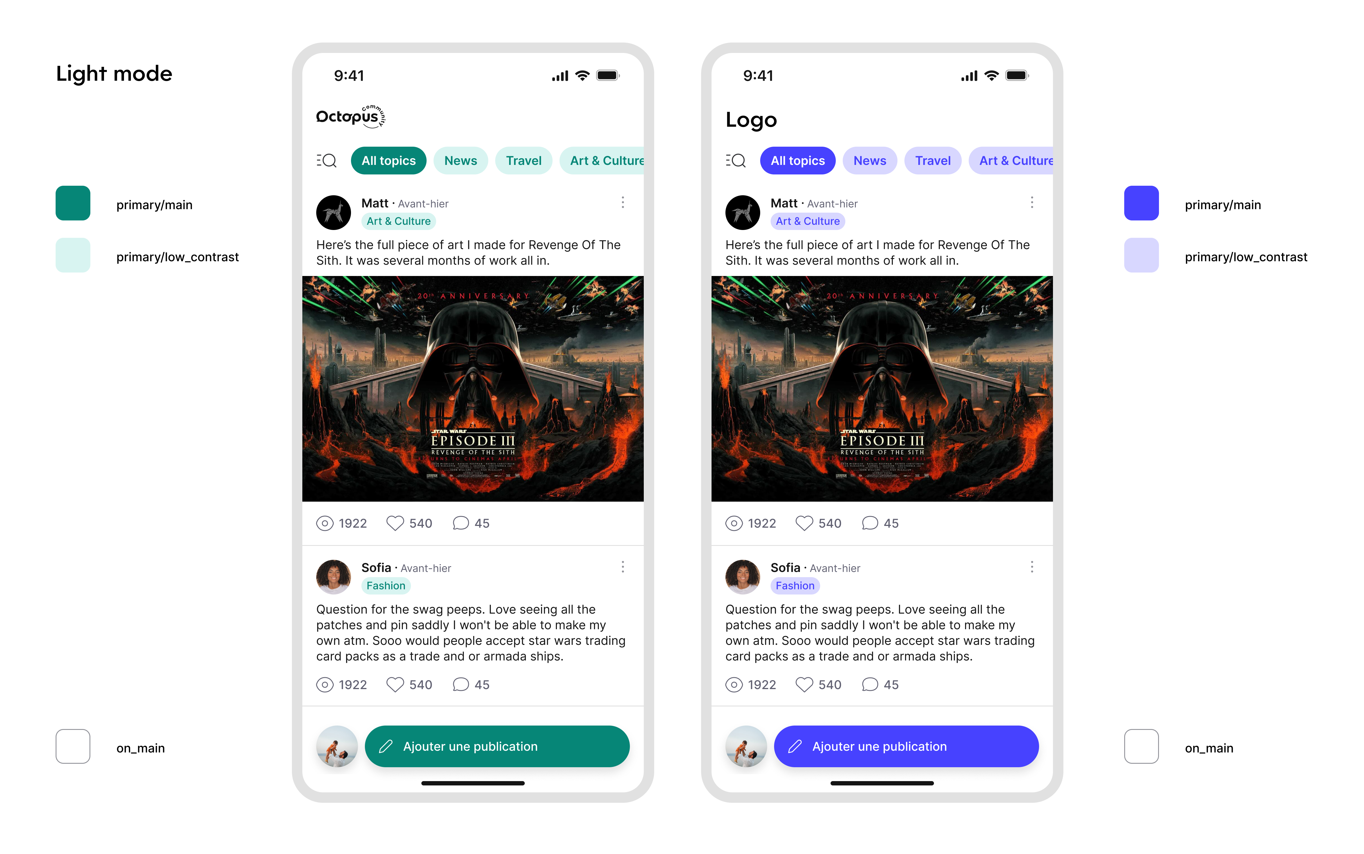
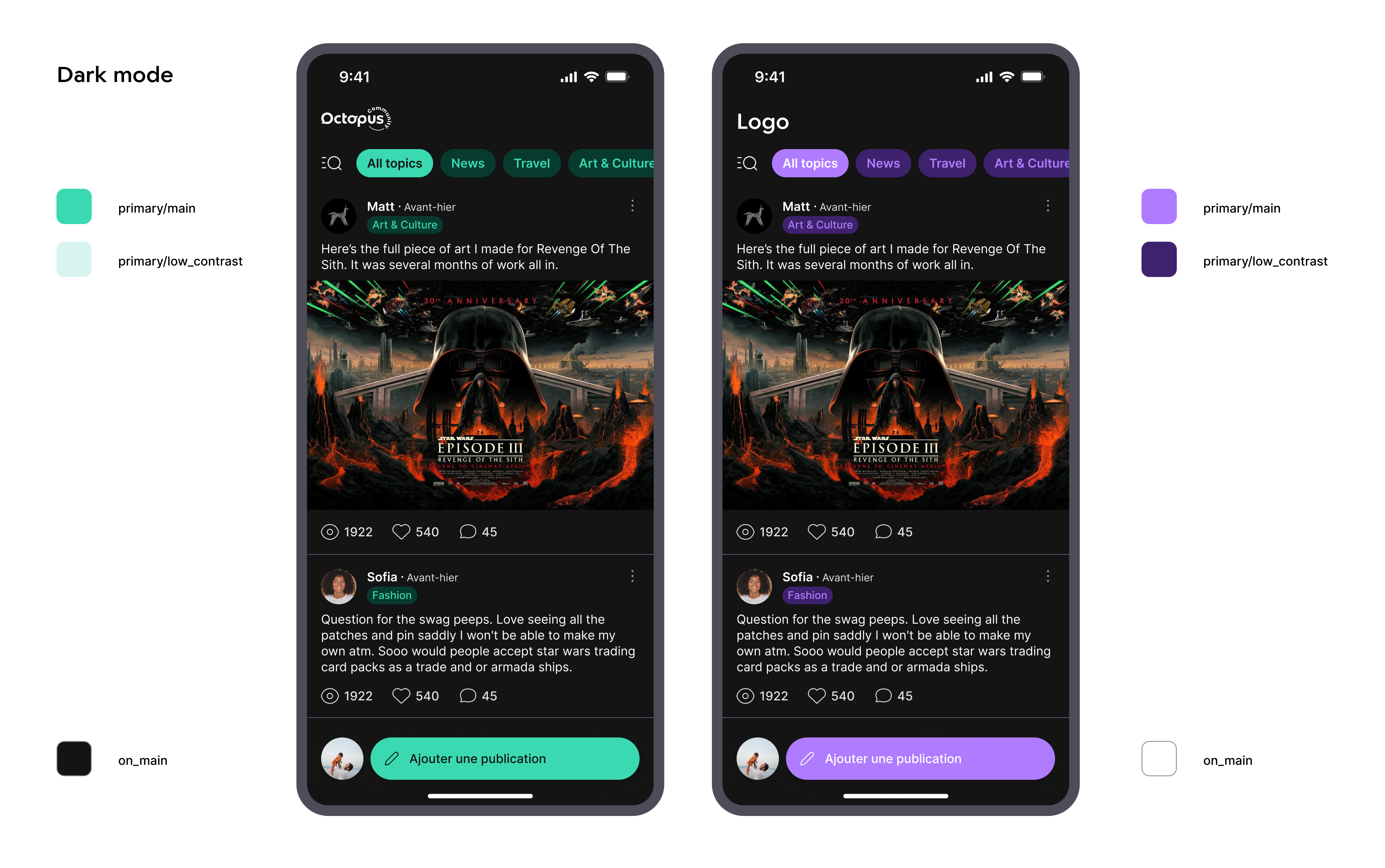
The Octopus SDK lets you modify its theme so its UI looks more like yours.
You can modify:
- the colors:
- the primary colors (a main color, a low contrast and a high contrast variation of the main color). Please note that the high contrast variation of the primary color is not used at the moment. If you do not pass a custom value for it, black/white default values will be used.
- the color of the elements (mostly texts) displayed over the primary color. If you do not pass a custom value for it, white/black default values will be used.
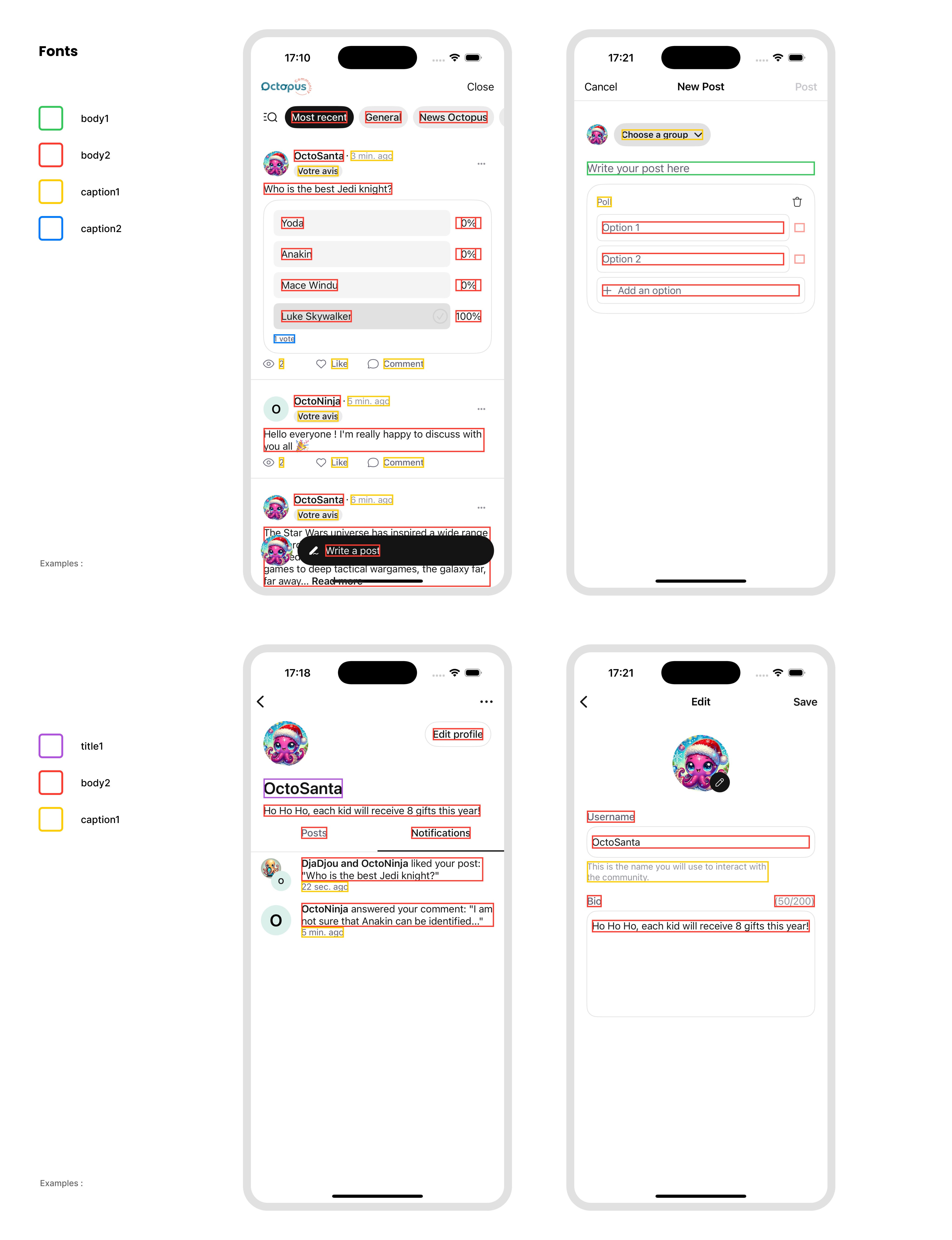
- the fonts. You can customize the styles (title1, body2, caption1...) used in the SDK. If you do not pass a custom value for it, default values will be used.
- the logo. This is an image displayed on the Octopus home page and profile creation view. If you do not pass a custom image for it, the Octopus logo will be used.
- the TopAppBar. You can customize the appearance, title, navigation icons, actions, and colors of the TopAppBar. If you do not pass a custom configuration for it, the default TopAppBar will be used.
By default, Octopus will rely on your application's MaterialTheme.colorScheme, but you can customize the UI more precisely by surrounding composables with the OctopusTheme:
To do that, you can override the theme by passing it as an environment object:
octopusComposables(
    navController = navController
) { backStackEntry, content ->
    OctopusTheme(
        colorScheme = if (isSystemInDarkTheme()) {
            octopusDarkColorScheme(
                primary = yourDarkPrimaryColor, // Default: MaterialTheme.colorScheme.primary
                primaryLow = lowContrastVersionOfYourPrimaryColor, // Default: MaterialTheme.colorScheme.primaryContainer
                primaryHigh = highContrastVersionOfYourPrimaryColor, // Default: MaterialTheme.colorScheme.inversePrimary
                onPrimary = yourDarkOnPrimaryColor, // Default: MaterialTheme.colorScheme.onPrimary
                background = yourDarkBackgroundColor // Default: MaterialTheme.colorScheme.background
                // See the complete list in the sources documentation
            )
        } else {
            octopusLightColorScheme(
                primary = yourLightPrimaryColor, // Default: MaterialTheme.colorScheme.primary
                primaryLow = lowContrastVersionOfYourPrimaryColor, // Default: MaterialTheme.colorScheme.primaryContainer
                primaryHigh = highContrastVersionOfYourPrimaryColor, // Default: MaterialTheme.colorScheme.inversePrimary
                onPrimary = yourLightOnPrimaryColor, // Default: MaterialTheme.colorScheme.onPrimary
                background = yourLightBackgroundColor // Default: MaterialTheme.colorScheme.background
                // See the complete list in the sources documentation
            )
        },
        typography = OctopusTypographyDefaults.typography(
            title1 = yourCustomTitle1Style, // Default: TextStyle(fontSize = 26.sp)
            title2 = yourCustomTitle2Style  // Default: TextStyle(fontSize = 22.sp)
            // See the complete list in the sources documentation
        ),
        drawables = OctopusDrawablesDefaults.drawables(
            logo = painterResource(R.drawable.your_custom_logo), // Default: R.drawable.ic_octopus_logo
            tint = yourLogoTintColor // Default: null (no image tinting)
        )
        // ... Check the complete parameters list in the sources documentation
    ) {
        content()
    }
}
Use the OctopusThemeGenerator to configure your Community theme with a live preview of the various Octopus screens.
All parameters of the theme have default values. Only override the ones that you want to customize. In the following example, you are creating an OctopusTheme with default colors, default fonts except for the title1, and a custom logo:
OctopusTheme(
    typography = OctopusTypographyDefaults.typography(
        title1 = TextStyle(fontFamily = FontFamily.SansSerif, fontSize = 24.sp)
    ),
    drawables = OctopusDrawablesDefaults.drawables(
        logo = painterResource(R.drawable.your_custom_logo)
    )
) {
    OctopusHomeContent(...)
}
Here is a summary of the impacts of the theme you choose:
Here is a summary of the text styles used in the main screens of the SDK:
Customize the TopAppBar
You can customize the appearance of the TopAppBar in the Octopus SDK screens by providing your own OctopusTopAppBar configuration when setting up the theme. We highly encourage you to choose a short text title (less than 18 characters).
OctopusTheme(
    ...
    topAppBar = OctopusTopAppBarDefaults.topAppBar(
        title = { text ->
            OctopusTopAppBarTitle(
                text = "Your TopAppBar Title", // Default: text
                logo = OctopusDrawable(painterResource(R.drawable.your_logo)), // Default: OctopusTheme.drawables.logo
                textStyle = yourTopAppBarTextStyle // Default: LocalTextStyle.current
            )
        },
        colors = OctopusTopAppBarDefaults.colors(
            containerColor = yourTopAppBarBackgroundColor, // Default: OctopusTheme.colorScheme.background
            contentColor = yourTopAppBarContentColor // Default: OctopusTheme.colorScheme.gray900
        ),
        navigationIcon = { type, onClick ->
            IconButton(onClick = onClick) {
                Icon(
                    imageVector = when (type) {
                        NavigationIconType.Back -> YourBackIcon
                        NavigationIconType.Close -> YourCloseIcon
                    },
                    contentDescription = when (type) {
                        NavigationIconType.Back -> "Navigate back"
                        NavigationIconType.Close -> "Close"
                    }
                )
            }
        },
        // ... Check the complete parameters list in the sources documentation
    )
)
The OctopusTopAppBar will automatically use your theme's color scheme if no specific colors are provided, ensuring consistency across your app.
Advanced Screen-Based Theming
For more complex theming scenarios, you can customize any aspect of the Octopus theme (colors, typography, drawables, TopAppBar) based on the current screen:
octopusComposables(
    navController = navController
) { backStackEntry, content ->
    OctopusTheme(
        colorScheme = when {
            // Post Details with branded theme
            backStackEntry.destination.hasRoute<OctopusDestination.PostDetails>() -> {
                octopusColorScheme().copy(
                    background = if (isSystemInDarkTheme()) Color.Black else Color.White
                )
            }
            else -> octopusColorScheme()
        },
        topAppBar = when {
            // Home screen with custom TopAppBar theme
            backStackEntry.destination.hasRoute<OctopusDestination.Home>() -> {
                OctopusTopAppBarDefaults.topAppBar(
                    title = { text ->
                        OctopusTopAppBarTitle(text = "My Community")
                    }
                )
            }
            else -> OctopusTopAppBarDefaults.topAppBar()
        }
    ) {
        content()
    }
}
Push Notifications ≥ 1.4.0
To increase user engagement, you can provide informations to the Octopus SDK so your users can receive push notifications when other users interact with them inside the community.
Octopus SDK is not asking for push notification permissions, we let you handle that part where it makes more sense in your app.
If your app does not support Push Notifications yet, you can follow the official Firebase documentation.
Our servers need your service account's private key file to be authorized to send notifications to your app on your behalf.
If you don't have this JSON file yet, follow this tutorial
- In the Firebase console, open Settings > Service Accounts
- Click Generate New Private Key, then confirm by clicking Generate Key.
- Securely store the JSON file containing the key.
More information can be found in the official Firebase documentation
Please send the json file using the online form sent by the Octopus team.
This JSON file is different from the one you are using to configure Firebase in your app (google-services.json)
Once your project is correctly set up for push notifications, you should forward the Firebase Cloud Messaging Token (FCM Token) to the Octopus SDK:
class MessagingService : FirebaseMessagingService() {
    override fun onNewToken(token: String) {
        super.onNewToken(token)

        // Register the new token with Octopus
        OctopusSDK.registerNotificationsToken(token)
    }
}
You are in charge of requesting the Notification permission and referencing your messaging service:
<uses-permission android:name="android.permission.POST_NOTIFICATIONS" />
if (checkSelfPermission(POST_NOTIFICATIONS) != PackageManager.PERMISSION_GRANTED) {
    // Request launcher for notification permission
    registerForActivityResult(
        contract = ActivityResultContracts.RequestPermission(),
        callback = {
            FirebaseMessaging.getInstance().token.addOnCompleteListener { task ->
                if (task.isSuccessful) {
                    OctopusSDK.registerNotificationsToken(task.result)
                }
            }
        }
    ).launch(POST_NOTIFICATIONS)
}
<service
    android:name=".notifications.MessagingService"
    android:exported="false">
    <intent-filter>
        <action android:name="com.google.firebase.MESSAGING_EVENT" />
    </intent-filter>
</service>
When you receive a notification message, first check if it is an Octopus notification by calling:
override fun onMessageReceived(remoteMessage: RemoteMessage) {
    super.onMessageReceived(remoteMessage)

    val isOctopusNotification = remoteMessage.data.isOctopusNotification
    if (isOctopusNotification) {
        // ... Handle the Octopus notification here (see below)
    }
}
If it's the case, display the Octopus notification using the Notification Manager:
val octopusNotification = OctopusSDK.getOctopusNotification(data = remoteMessage.data)
if (octopusNotification != null) {
    notificationManager.notify(
        octopusNotification.id,
        Notification.Builder(this, CHANNEL_ID)
            .setSmallIcon(R.drawable.ic_stat_notification)
            .setColor(getColor(R.color.accent))
            .setAutoCancel(true)
            // Extension function to extract the title, text and deep link from the OctopusNotification
            .setOctopusContent(
                context = this,
                activityClass = MainActivity::class,
                octopusNotification = octopusNotification
            ).build()
    )
}
- The
activityClassmust be the one containing the compose content with theoctopusNavigation()subgraph. - The
setOctopusContentfunction is based on a deep link mechanism that will automatically launch the activity and navigate to the corresponding screen within the Octopus navigation graph. - You can also handle the content manually by using the
OctopusNotification'stitle,body, andlinkPathfields and configuring your ownPendingIntent.
Not seen notifications ≥ 1.3.0
To increase user engagement, let your users know that they have new notifications from the Octopus notification center. Displaying a badge with the number of new notifications in your app can be a great way to suggest your users to look at what's new in the community again.
To do that, the Octopus SDK exposes a val notSeenNotificationsCount: Flow<Int>
that you can collect:
OctopusSDK.notSeenNotificationsCount.collect {}
If you want to update this value with the latest count, simply call:
OctopusSDK.updateNotSeenNotificationsCount()
To see a full example of how you can achieve that, you can follow how it is done in the Samples, in the octopus-auth/fullscreen app.
Analytics
Octopus Community provides analytics to help you better understand your users' behavior within the community. To improve the quality of these analytics, we offer features that allow you to provide additional information about your users.
Custom events ≥ 1.4.0
You can tell the SDK to register a custom event. This event can be merged into the reports we provide.
OctopusSDK.track(
    event = TrackerEvent.Custom(
        name = "Purchase",
        properties = mapOf(
            "price" to TrackerEvent.Custom.Property(
                value = String.format(Locale.US, "%.2f", 1.99)
            ),
            "currency" to TrackerEvent.Custom.Property(value = "EUR"),
            "product_id" to TrackerEvent.Custom.Property(value = "product1")
        )
    )
)
Community Visibility ≥ 1.3.0
If you enable access to the community for only a subset of your users and want the analytics we provide to take this into account, you can inform the SDK accordingly.
This information is reset at each SDK launch so be sure to call the function everytime and as soon as possible after SDK init.
This section is only usefull when the host app (i.e. your app) manages its own A/B testing logic. Call this if your app is running its own A/B test and you want Octopus to log whether a given user is in the "community-enabled" or "control" group. This is useful for reporting and engagement analytics, but does not change the SDK’s runtime behavior.
OctopusSDK.trackAccessToCommunity(hasAccess = canAccessCommunity)
Depreacted < 1.6.0
OctopusSDK.setHasAccessToCommunity(canAccessCommunity)
Bridges ≥ 1.5.0
Octopus provides a way to create posts that reference your own content — we call this a bridge. To create a bridge, your content (an article, a product, etc.) must have a unique identifier. This ID will be used to link your content to the post. It will also allow users in the Octopus Community to directly view your content.
We recommend adding a button in your app that encourages users to talk about your content.
The bridge process involves three main steps:
Step 1: Prepare the post data Use the SDK to get (or create) the ID of the post related to your content.
- First get from the SDK the id of the post to display. The SDK will create the post if it is not already created. To do that, call the dedicated API and pass the required data:
- Content id (called clientObjectId) that the post will be about
- Title of the post. It must be between 10 and 3000 characters..
- Catchphrase (optional). It will be displayed below the title, in bold. You can use something like "What do you think about this?". It must be less than 84 characters and we recommand between 6 and 38 characters.
- Image for the post (optional). You can either pass a remote image using an URL or a local image.
The image must respect these requirements:
- File size must be less than 50Mb
- File format must be jpg or png
- Image sides must be between 50px and 4000px, with a max ratio of 32:9 (bigger side / smaller side)
- If you pass a remote image, the resource should be public
- Text of the button that will invite your users to display your content (optionnal). You can use something like "Buy it" if your content is a purchasable product, or "Read the article" if it is a press article. When the button containing this text will be tapped, the SDK will ask you to display your content. If no text is provided, the button won't be displayed. It must be less than 28 characters, we recommand between 4 and 28 characters.
- Topic id (optional). This is the id of the topic that you want the post to be labelled with. If not provided, the topic will be automatically set according to your community settings. You can retrieve the list of the available topics with the dedicated API (see below).
- Signature (optional). For security reasons, to ensure that the request is coming from you, you can provide a signature. The need for the signature is based on your community settings, we highly encourage you to enable this security check by contacting us. Therefore, you must add a route like
/generateBridgeSignatureto your backend to generate this token based on the same algorithm as generating the token for users (subis not required for this process).
Step 2: Get the post ID
Calling the API with the previously created post data will return a post ID. With this ID, you can display the post using the Octopus UI. If the post is not created, this API will create it, otherwise it won't change its content.
Step 3: Handle user interaction
Optionally, you can register a callback to be notified when a user wants to view your content from a bridge post. The SDK will provide the clientObjectId so you can open the appropriate content.
Let's see how to do it with an example of a recipe app:
Prepare the ClientPost:
val clientPost = ClientPost(
    objectId = "recipe-129302938", // A unique identifier for your content
    text = "The perfect Canelés", // Between 10 and 3000 chars
    attachment = Image.Remote(url = imageUrl), // You can also pass Image.Local(uri)
    topicId = foodRecipeId, // The id of the Octopus topic. Null if default.
    catchPhrase = "Tried the canelés? Tell us how good they were!", // Less than 84 characters
    viewObjectButtonText = "Read the recipe", // Less than 28 characters
    signature = token
)
Then get the post for this recipe:
val result = OctopusSDK.fetchOrCreateClientObjectPost(clientPost)
when (result) {
    is OctopusResult.Success -> {
        val post = result.data
        // Navigate to the post or handle success
    }
    is OctopusResult.Error -> {
        // Handle error
    }
}
You can also monitor existing cached posts for your content:
OctopusSDK.getClientObjectPost(clientObjectId = "recipe-129302938").collect { post ->
    // - Post will be null if no post exists yet
    // - Post will contain the Post object if one exists and has already been fetched
}
To retrieve available topics:
// Get cached topics
OctopusSDK.topics.collect { topics ->
    // List of available topics
}

// Fetch latest topics from server
OctopusSDK.fetchTopics()
Register a callback to know when a user wants to see your content from within the Octopus Community UI:
// In your NavHost setup
octopusComposables(
    navController = navController,
    onNavigateToClientObject = { objectId ->
        // Display the content that has the given objectId
    }
)
To see a full example of how you can achieve that, you can follow how it is done in the Samples, in the "Octopus-Auth - FullScreen App". The MainViewModel is in charge of preparing the client post and getting the post.
Octopus A/B Testing ≥ 1.6.0
The A/B test feature lets you measure the impact of the community on your app usage by splitting your audience into two cohorts:
- Test group: a portion of users (e.g., 30%) with full access to the community.
- Control group: the remaining users (e.g., 70%) without access. For them, when they tap the community button, Octopus displays a screen: “The community is not available yet for you, please come back later.” In Octopus Analytics, you’ll then see clear comparisons between these two cohorts in terms of app session volume and retention.
Even if this A/B Test is totally internal, we let you override the group assigned to the connected user. This can be useful during your tests to check what will see the users of each group or even to provide or disable access to some given users.
Use this method when you need to guarantee that the user’s community access is enforced by Octopus, regardless of internal A/B testing rules.
OctopusSDK.overrideCommunityAccess(hasAccess = canAccessCommunity)
To see a full example of how you can achieve that, you can follow how it is done in the Samples, in the octopus-auth/fullscreen app.
Follow the Samples
Want to see a code examples on how to use the SDK, no worries, we have that for you!
-
First, clone the OctopusSDK project
-
Add those lines to the root project
local.propertiesfile:OCTOPUS_API_KEY=YOUR_API_KEY
OCTOPUS_SSO_CLIENT_USER_TOKEN_SECRET=YOUR_USER_TOKEN_SECRETReplace
YOUR_API_KEYwith your own API key andYOUR_USER_TOKEN_SECRETwith your own token secret. -
According to your use case, select the corresponding build variant and run the sample app.
-
Add this line to the root project
local.propertiesfile:OCTOPUS_API_KEY=YOUR_API_KEYReplace
YOUR_API_KEYwith your own API key. -
Run the
samples.octopus-auth.fullscreenorsamples.octopus-auth.embedapp depending on your needs.